Metrics Module: Score
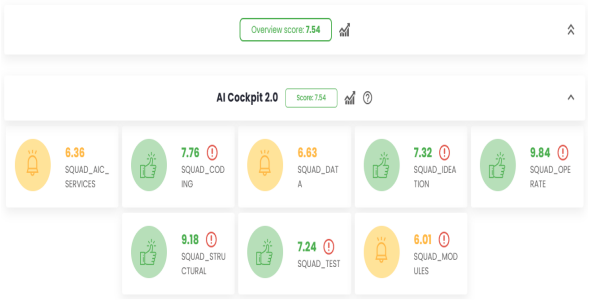
The Score page within the Metrics module provides an overview of the scores for each team and tribe within an organization. It also aggregates an overall score for the organization, calculated as the average score of all the teams that make it up.
Score Page
At the top of the page is the Overall Score, which is the aggregated score for the entire organization. Below it is Tribe 1, with its corresponding score displayed next to it. Tribe 1 also contains 3 teams, each with its own score. The average score of these teams determines the score for the tribe.
An organization can contain multiple tribes, which are displayed alongside their respective teams, organized in a vertical sequence. Additionally, it is possible to minimize the display of teams, allowing a focused view that highlights only the tribes.
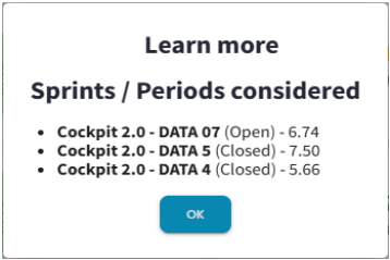
The score for each team is defined by the sprints/periods loaded in the VSM. When clicking on a tribe’s score, the sprints/periods being considered are listed.
On the left side of each team, there is an image that indicates whether the score is considered good, intermediate, or poor, according to the organization’s configurations. A good score is shown in green, an intermediate score is yellow, and a poor score is red. This color scheme provides a clearer view of each team’s performance in line with the organization’s expectations. By clicking on a team’s name, the user will be redirected to the VSM page.
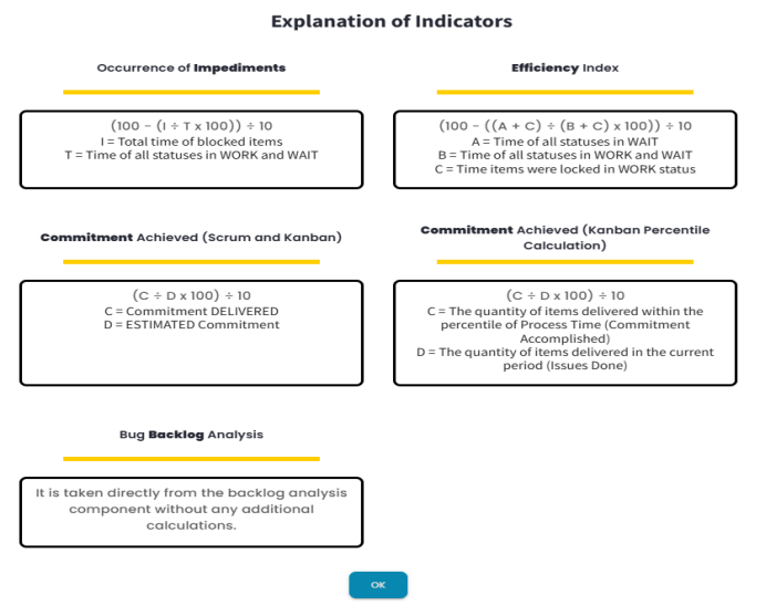
Next to each tribe’s name, there is a help icon. This icon opens a modal that displays the indicators that make up each team’s score and explains how they are calculated.
Next to each tribe, there is a chart icon that directs the user to the Tribe Consolidation page. The same icon is shown next to the overall score, but this one directs the user to the Alliance View page.
Tribe Consolidation Page
To access the Tribe Consolidation page you need to click on the chart icon next to the desired tribe name on the Score Page. The page provides a comparative view of the teams that make up the tribe and an average of the scores from all the teams.
At the top of the page, there are several toggles that allow you to activate or deactivate specific teams and also consider only the average score.
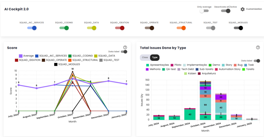
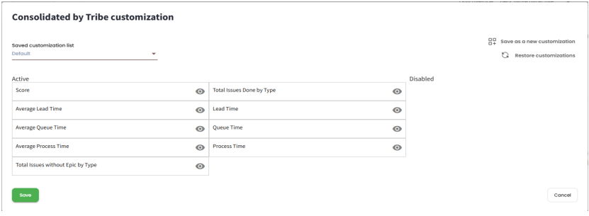
You can also customize which charts should appear and in which order by clicking on the Customization option in the top right corner of the page. This will open a modal.
Indicators
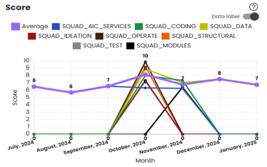
Score
This indicator shows the evolution of the main VSM (Value Stream Management) score of the squads over time. The score reflects the squads’ performance based on the criteria defined in the VSM. The average displayed in the graph excludes scores of zero for the month, ensuring that only relevant data is considered for analysis. This approach provides a clear and accurate view of the squads’ performance, allowing the identification of trends and areas for improvement over the analyzed period.
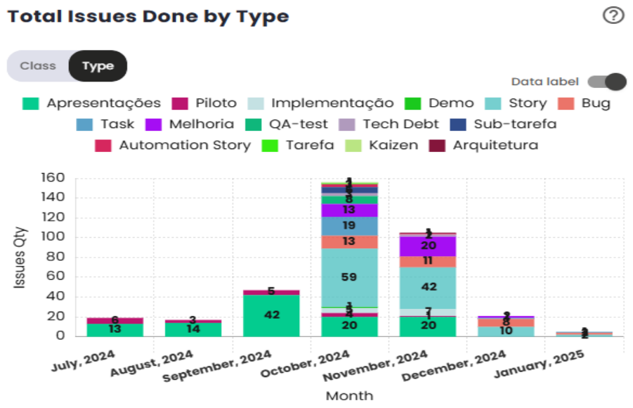
Total of Completed Issues by Tribe
This indicator displays the total number of completed issues by type, concluded by all squads during a specific month. It sums up the number of issues delivered, categorizing them by type, to provide an overview of the completed work volume. For example, if in a given month Squad A delivered 5 Stories and Squad B delivered 4 Stories, the graph will show a total of 9 completed Stories. This indicator helps track the squads’ progress in terms of deliveries, providing a consolidated view of team productivity during the period.
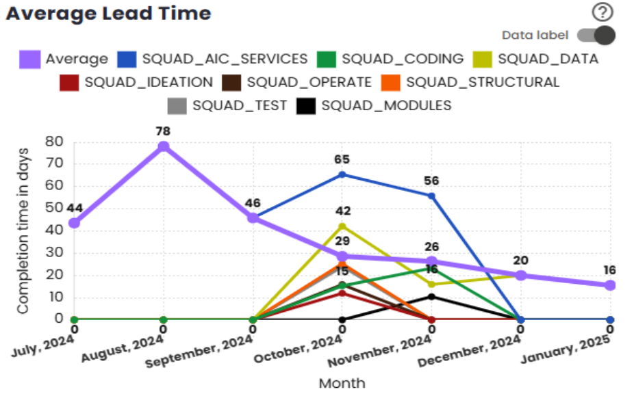
Average Lead Time
This indicator displays the evolution of the squads’ Lead Time over time. Lead Time is defined as the total time elapsed from the creation of an issue to its completion. The graph shows the average Lead Time for the squads, allowing you to track variations over the analyzed period. The average calculated excludes zeroed scores for the month, ensuring that the analysis is based only on relevant data, providing an accurate view of the time required for the squads to complete tasks.
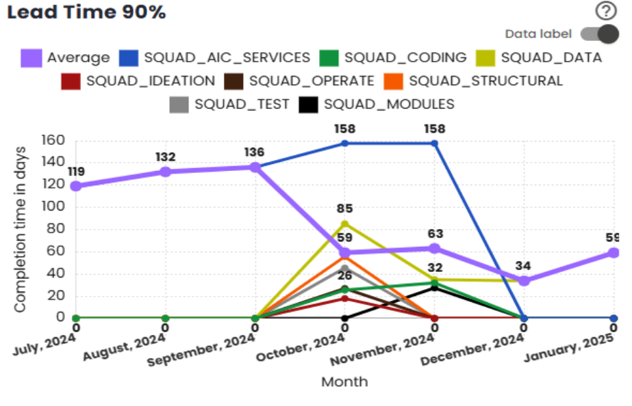
Nth Percentile Lead Time
This indicator displays the evolution of the squads’ Lead Time over time, considering the nth percentile defined by the organization. Lead Time is the time elapsed between the creation of an issue and its completion. The graph uses percentiles such as 75%, 80%, 85%, 90%, or 95%, representing the cutoff point that includes issues within the analyzed period. The average shown on the graph excludes zeroed scores for the month, ensuring that the analysis is based only on issues that generated relevant data, providing an accurate view of the squads’ performance concerning task completion times.
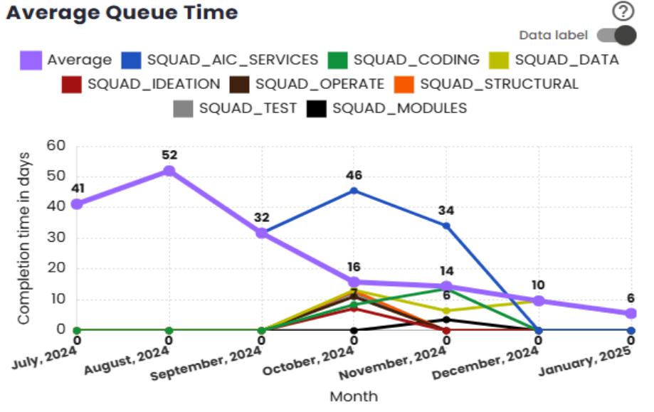
Average Queue Time
This indicator shows the evolution of the squads’ Queue Time over time. Queue Time is the time elapsed between the commitment point of an issue and its completion. The graph presents the average of this time, allowing analysis of how the squads are handling the wait time between the commitment and completion of tasks. The calculated average excludes zeroed scores for the month, ensuring that the calculation reflects only periods with relevant activity, providing an accurate view of the squads’ performance regarding the wait time for issues.
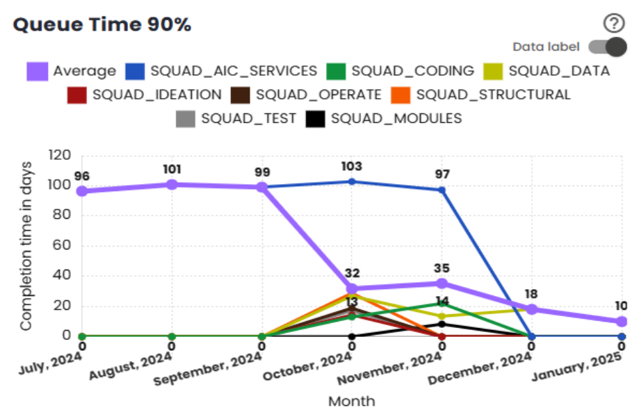
Queue Time nth percentile
This indicator shows the evolution of the squads’ Queue Time over time, considering the nth percentile. Queue Time is defined as the time elapsed between the commitment point of an issue and its completion. The graph uses percentiles such as 75%, 80%, 85%, 90%, or 95%, representing the cutoff point that includes the issues within the analyzed period. The average displayed in the graph excludes zeroed scores for the month, ensuring that the analysis is based only on issues that generated relevant data, providing an accurate view of the squads’ performance in relation to the wait time between commitment and completion of tasks.
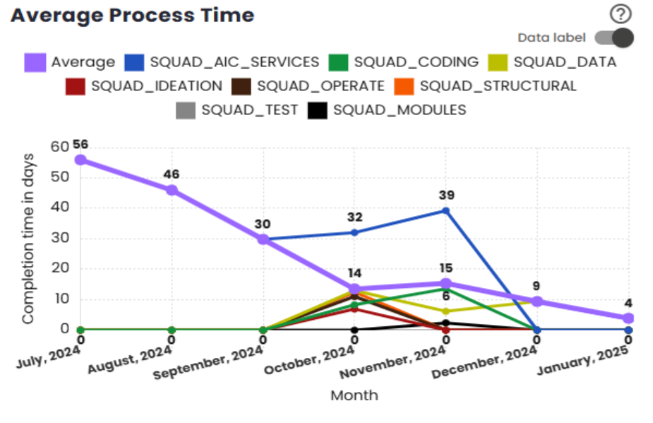
Average Process Time
This indicator displays the evolution of the squads’ Process Time (or Touch Time) over time. Process Time is defined as the time elapsed between the start of actual work on an issue and its completion. The graph shows the average of this time, allowing tracking of how squads are managing the execution time of tasks after starting work on them. The average calculated excludes zeroed scores for the month, ensuring that the analysis focuses only on issues with relevant data, providing an accurate view of the squads’ performance in the execution process.
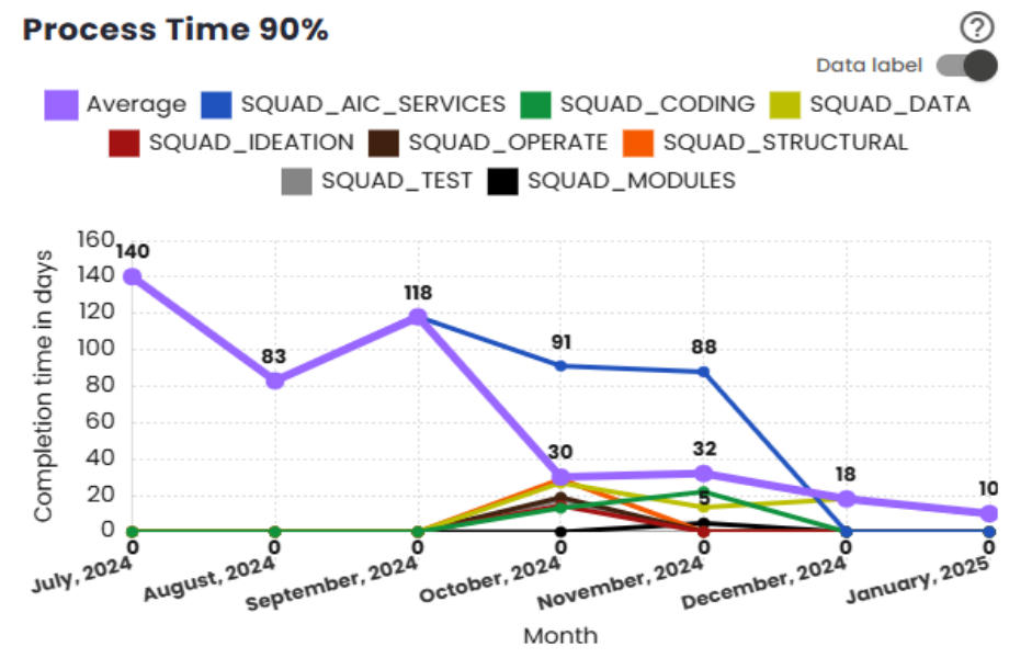
Nth Percentile Process Time
This indicator shows the evolution of the squads’ Process Time (or Touch Time) over time, considering the nth percentile. Process Time is the time elapsed between the start of actual work on an issue and its completion. The graph uses percentiles such as 75%, 80%, 85%, 90%, or 95%, representing the cutoff point that includes issues within the analyzed period. The average displayed excludes zeroed scores for the month, ensuring that the analysis only considers relevant data, providing an accurate view of the squads’ execution time for tasks based on the selected percentile.
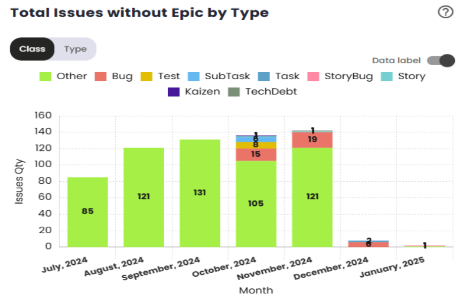
Total of Issues without Epic by Type
This indicator shows the total number of issues without an epic by type for all squads in a given month. It counts the issues of each type that are not associated with an epic, providing insight into the volume of work that is not directly tied to larger initiatives or projects. For example, if in a given month Squad A has 3 Stories without an epic and Squad B has 1 Story without an epic, the graph will show a total of 4 Stories without an epic. This indicator helps monitor the type of work being performed independently of epics, offering insights into the distribution of tasks across the squads.