Metrics Module: Teams
Introduction
The main page of the Metrics Module is the teams’ page, which shows a view of the teams’ development over time. It is possible, through this page, to assess the team’s maturity using the maturity matrix and access various development metrics by navigating to the VSM (Value Stream Mapping) page. This view allows the user to have greater control over the various contexts that encompass their teams and, in this way, take actions for their evolution.
Main page
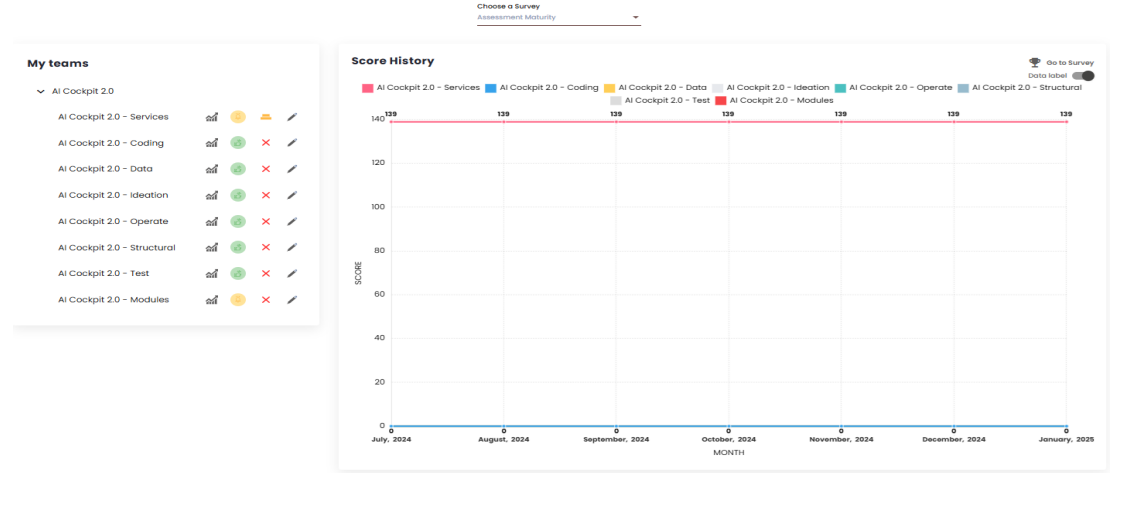
The main page of the Metrics module is the Squads page. It consists of a matrix selection dropdown; a chart where you can view the selected matrix; and a list of all the squads in the organization.
Matrix
The matrix is composed of categories and indicators that can be customized according to the organization’s needs. For each indicator, a value can be added, generating an overall score for each squad. The main Squads page displays a chart with this score over time, where each line represents a squad in the organization. It is also possible to view the chart without the values by deactivating the “Data Label” toggle just above the chart. This allows for a better visualization of the squads’ evolution or decline curves. Additionally, an organization may have more than one matrix. In such cases, the user can switch between them using the “Choose a Matrix” dropdown. By clicking on “Go to Matrix,” the "Squad Maturity"page opens.
Squad list
In addition to the matrix, the Teams page also displays a “List of Teams” in the organization. Next to each team’s name, there are four items: the first takes the user to the Value Stream Mapping (VSM) page, which will be discussed later; the second item functions as a traffic light and shows a color based on the team’s score within the VSM: red for a low score, yellow for attention, and green for a good score. The score that determines these colors is configured by the organization. The third item shows the adherence, calculated based on the responses to the selected matrix; and the fourth item, represented by a pencil icon, is where the matrix indicators are answered.
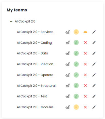
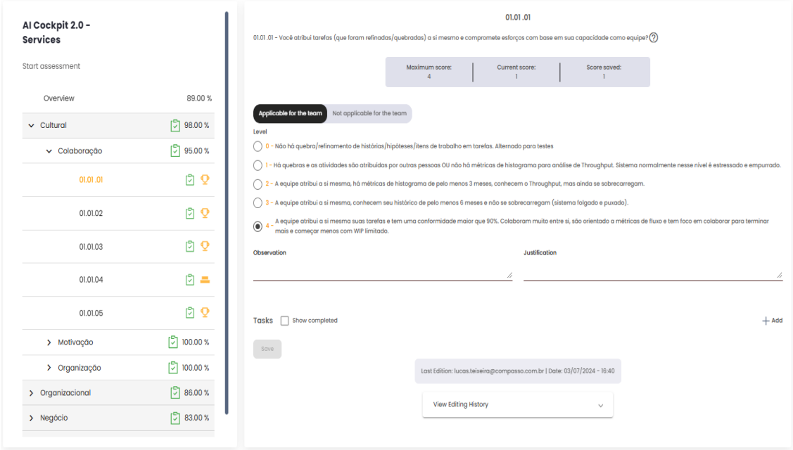
By clicking on the fourth item, the user is directed to a page where they can view the matrix in more specific graphs, showing the results of the answers to the various indicators and categories of the matrix. It is also possible to add values to each indicator that defines the selected matrix. To answer the indicators, simply click on them in the list displayed on the left side of the screen. These values are used in the construction of the matrix over time.
VSM
The Value Stream Mapping (VSM) page aims to display various indicators, calculations, and charts. It shows the progress and evolution of squads in relation to their estimates and deliveries within Sprints or Periods. This data is pulled directly from the client’s management platform, ensuring that the indicators and charts are always up-to-date and consistent with the actual situation.
To begin using the VSM page, it is important to first understand a few factors, such as adding, editing, and deleting sprints/periods, personalizing the page, and configuring its settings.
Add a Sprint or Period
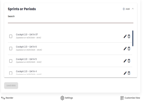
The first step is to check which sprints or periods you want to generate calculations for. To do this, you need to add a sprint or period. Click on "Add,"and a modal will open.
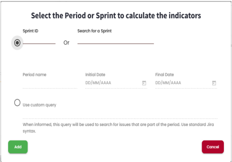
To add a sprint, simply select the upper checkbox and then search for it by its ID or name. These details must match those provided in the management platform used by the client, as it is from there that the data is pulled for the calculations. For adding a period, select the lower checkbox, give it a name, and define a start and end date for the period. When you click "Add,"the sprint or period will be added to the list.
Edit a Sprint or Period
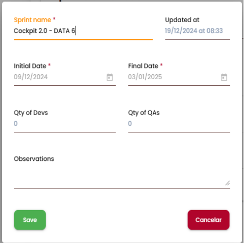
By clicking on the pencil icon, you can edit the sprint/period. A modal will open. This modal allows you to: edit the name of the sprint/period; view the start and end dates of the sprint, and in the case of periods, you can also edit these values. You can also define the number of developers and QAs, as well as add any observations.
Delete a Sprint or Period
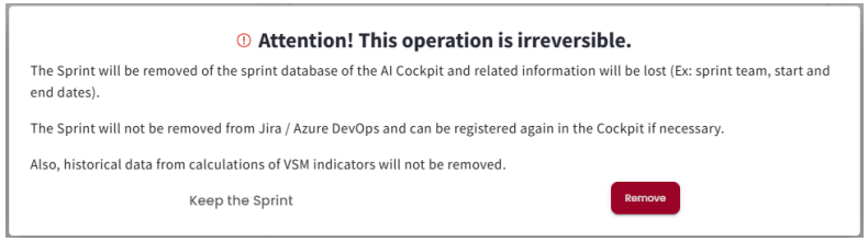
By clicking on the trash can icon, you can delete a Sprint/Period. A message will then be displayed to confirm the user’s intention and minimizing the possibility of accidental deletion. When a sprint/period is deleted, it will not be modified within the client’s management platform. If it needs to be added again, simply follow the process for adding a sprint/period as described earlier.
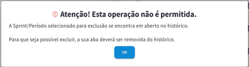
If the sprint/period is currently loaded in a tab, it will not be possible to delete it. A warning message will appear, instructing the user to first delete the tab and then try deleting the sprint/period again.
Load Data
After adding sprints or periods, you can select which ones you wish to view and click "Load Data." After this action, all selected sprints/periods will be displayed in tabs. The first time a sprint/period is loaded, a search will be performed to gather all the necessary data for calculations and chart creation. This may take some time, depending on the amount of information the squad has in its backlog.
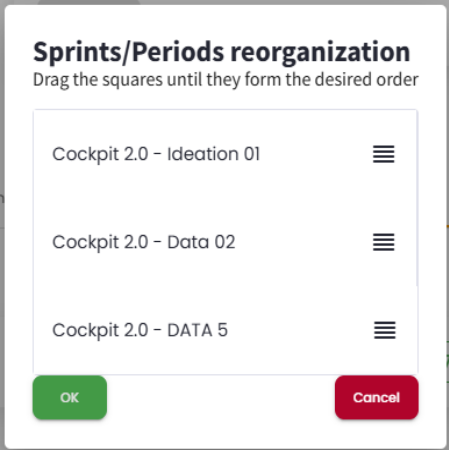
Reorder
After the data is loaded, each sprint/period will be displayed in its corresponding tab. When more than one sprint/period is loaded, a comparison tab will also be created, showing various comparison indicators between the sprints/periods displayed in the tabs. This comparison takes into account the order of the sprint/period tabs, so it may be necessary to reorder them. Reordering is useful for comparison purposes or to improve visibility. After clicking "Reorder"(below the sprint/period list), a modal will open, allowing you to drag and drop the sprints/periods into the desired order. Once the order is selected, the user can click "Cancel"to discard the changes or "OK"to apply the new tab order.
Settings
When added to the AI Cockpit, an organization is configured; however, it is possible to make some modifications by squad if needed, by clicking on Settings below the list of sprints/periods. The settings are divided into six factors: Basic, Types, Commitment, Workflow, Organization, and Others. The goal is to guide the calculations performed to reflect the squad’s reality.
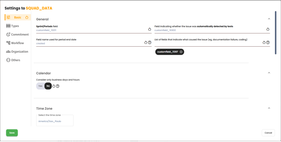
After making any modifications to the settings, it is necessary to recalculate all sprints/periods so that they can be updated with the new configurations.
Customization
It is also possible to customize the page to display only the desired indicators and charts, and define the order in which they should appear. To do this, click on "CUSTOMIZATION"below the list of sprints/periods. A modal will open to make these configurations.
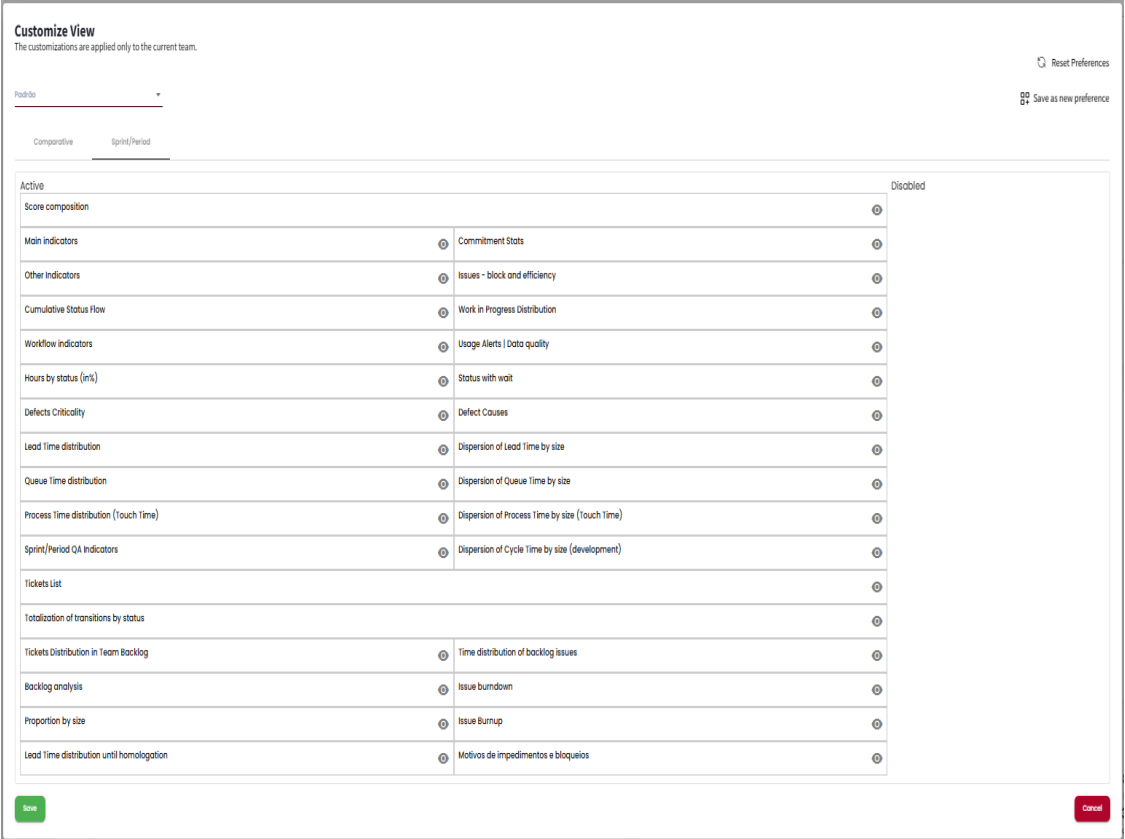
This page consists of two tabs where you can customize the “Sprint/Period” and/or “Comparison” tabs. There are also two columns: “Active” and “Inactive.” By clicking on an item, it is moved to the other column. All items in the “Active” column will be displayed on the VSM page, while those in the “Inactive” column will be hidden. To reorder the items, simply drag them to the desired position. The items at the top will be displayed first on the VSM page, providing quicker access.
After loading a sprint/period, a tab will open containing information about the indicators and charts. Three actions related to this tab can be performed via the icons shown in the top right corner:
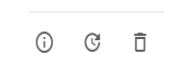
- 1 - Sprint detail - Clicking on this icon will open a modal with the following information about the opened sprint/period: Name, Commitment Type, Start Date, End Date, Status, Developers, QAs, and Observations.
- 2 - Recalculate - After loading a sprint/period for the first time, it may be necessary to reload it (e.g., changes in settings or system updates). To do this, just click on this icon, and the reload process will begin.
- 3 - Discard results - Clicking this icon will remove the tab, but the sprint/period will remain in the Sprints/Periods list to be loaded again if needed. After making a customization modification, it is possible to save it with a name, allowing the user to store multiple customizations. This makes it easier to access the most relevant indicators for their reality in different contexts. After making a customization modification, it is possible to save it with a name, allowing the user to store multiple customizations. This facilitates access to the most relevant indicators for their reality in different contexts.
Sprint/Period Indicators
In this section, we will explore all the indicators and charts displayed on the VSM page, under the Sprint/Period tabs, to provide a better understanding of their contexts.
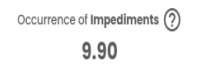
Sprint Score
This indicator aims to evaluate the performance and progress of the sprint/period in question. There are five main indicators considered, and their calculation consists of the arithmetic mean of these indicators.
Sprint Score = (Sum of indicators) / 5
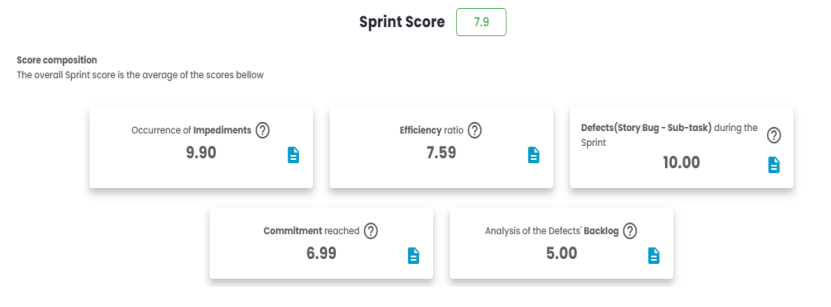
Sprint Score = (9.90 + 7.59 + 10 + 6.99 + 5.00) / 5 = 7.9
Each of the five indicators has its own rules and formulas, described as follows:
Impediment Occurrence
This indicator ranges from 0 to 10, with 10 representing a scenario where no blockages were found during the sprint or period. It will decrease in value whenever an item is blocked. Therefore, it is inversely proportional to the percentage of blocked items (% Blocked).
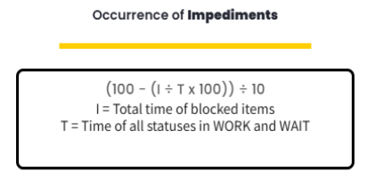
The two indicators, "I"and "T", can be found in the Main Indicators card, under the names Total Hours of Blocked Items and Total Hours of Items in Work and Wait, respectively.
Impediment Occurrence = (100 - (309.26 / 8092.86 * 100)) / 10
Impediment Occurrence = 9.62
Efficiency Index
This indicator ranges from 0 to 10 and measures the relationship between:
- How much time items spent in stages of the flow where value is added (WORK).
- How much time items spent in stages of the flow where no value is added (WAIT).
- How much time items spent in stages of the flow where value is added (WORK), but were blocked.
(100 - ((A+C) / (B+C) * 100)) / 10
A = Time all statuses were in "WAIT" B = Time all statuses were in "WORK"and "WAIT" C = Time items were blocked in "WORK"status
The blocked time (C) is added to both the numerator and the denominator, as the blockage is treated as a significant part that impacts both "WAIT"and the overall flow.
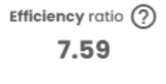
Efficiency Index = (100 - ((1333.3 + 0) / (5535.96 + 0) * 100)) / 10
Efficiency Index = 7.59
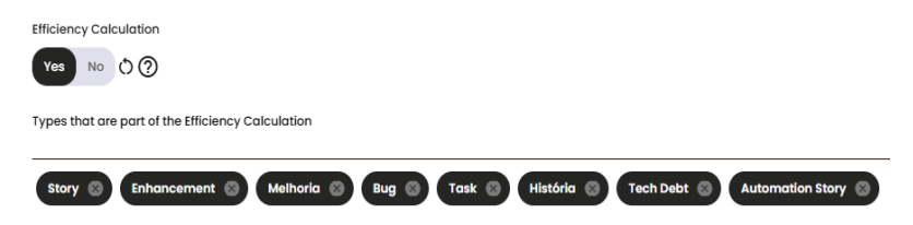
The values may be adjusted depending on a setting in the squad’s calculations. If the Efficiency calculation is enabled, only the issue types used in this indicator will be part of the efficiency index calculation. If it is disabled, the values will be based on all the issue types that are part of the commitment.
In this indicator, we can see a list of issues that were blocked during the sprint/period. By clicking on the blue icon next to the value, a modal will display details such as Block Time, Block Status, and the Current Status.
For a better understanding of the calculation and which issues are being used, you can see the details of the issues by clicking on the blue icon shown on the card. This will open a modal.
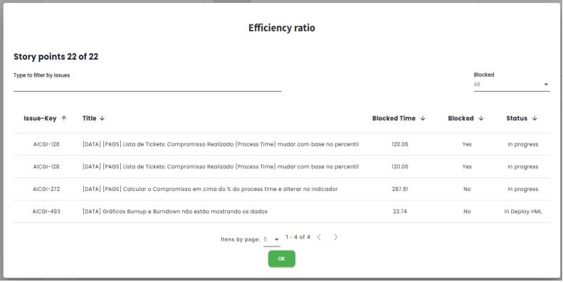
By clicking on the Issue-Key associated with the desired issue, the user will be directed to their management platform and will be able to see the issue in question. It is also possible to perform a filter to show only the issues that are blocked or not.
Defects during Sprint/Period
This indicator ranges from 0 to 10 and measures the number of defects found in the sprint or period. A value of 10 represents a scenario where no story bugs or sub-bugs were found; this value will decrease whenever one is found.
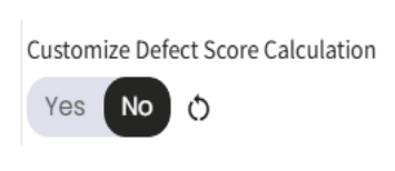
In the commitment area of the squad’s settings, there is a toggle that, when enabled or disabled, changes the types of issues included in this indicator. If the toggle is enabled, issues related to tasks and bugs will be included in the defect calculation during the sprint/period.
(100 - (D * 100)) / 10
When disabled "Custom Defects Calculation" D = (Total StoryBug / (Total Story + Total Debt Tech + Total Improvement))
When enabled "Custom Defects Calculation" D = (Total StoryBug / (Total Story + Total Debt Tech + Total Improvement + Total Task + Total Bug))
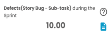
Defects during the Sprint = (100 - (0 * 100)) / 10
Defects during the Sprint = 10
Commitment reached
Commitment refers to all items that were proposed to be delivered within a specific time frame, which may vary depending on the agile process used. The tool provides three types of calculations: Scrum, Kanban by Percentile of Process Time, and Kanban commitment delivered vs. estimated.
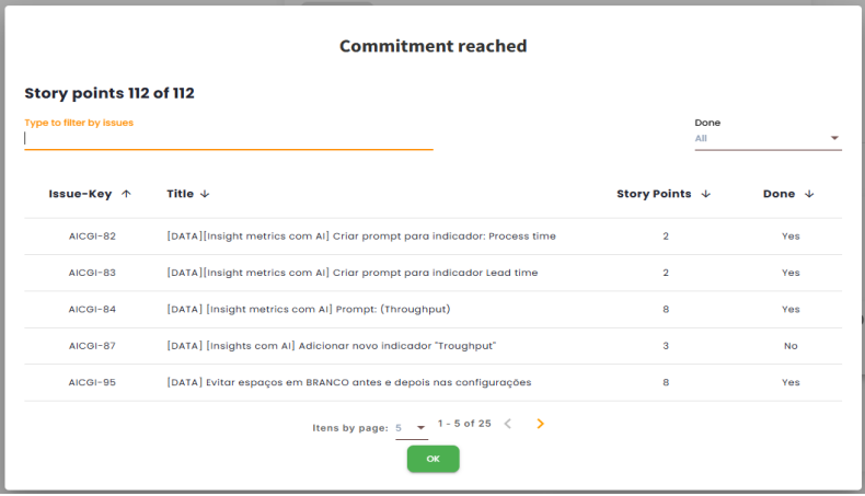
This indicator ranges from 0 to 10 and measures the completeness of the items that are part of the sprint or period commitment. By clicking on the blue icon displayed on the card, it is possible to view details of the issues included in the calculation and filter them by completed or not.
Scrum
The calculation is based on the percentage of completion of the commitment (% Completion), found alongside the commitment indicators.
C / D * 100) / 10
C = Commitment DELIVERED D = Commitment ESTIMATED
The two indicators used to compose the Reached Commitment score can be found on the Commitment Indicators card. Where C is the number of Planned Story Points and D is the number of Completed Story Points.
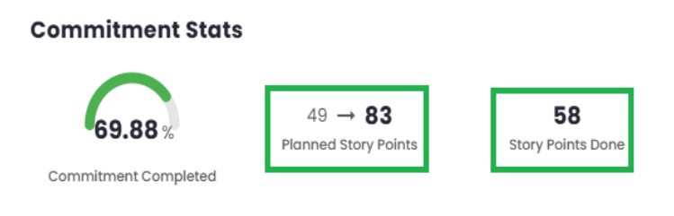
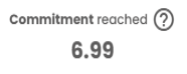
Commitment reached = (58 / 83 * 100) / 10
Commitment reached = 6.99
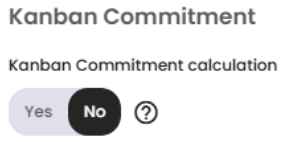
Kanban
The Kanban calculation can be done in two ways. To switch between them, it is necessary to modify the toggle button, which can be found on the page Admin > Organizations > VSM Parameters under the Organization tab, named Kanban Commitment. Administrator permissions are required to make this change.
Kanban by Process Time Percentile
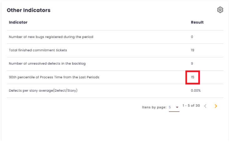
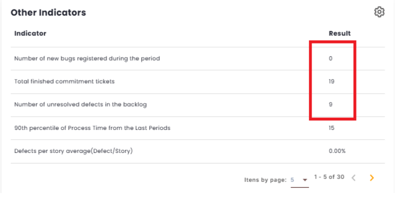
If the toggle is enabled, only issues with a Process Time less than or equal to the average Process Time Percentile of the last 3 periods will be counted. This value can be found in the Other Indicators.
Here is the formula for how the Kanban calculation by Process Time Percentile is done:
(C / D * 100) / 10
C = Quantity of items delivered within the Process Time percentile (Commitment Fulfilled) D = Quantity of items delivered in the current period (Completed Issues)
Kanban commitment delivered by estimated
If the toggle is disabled, the calculation will be similar to
Scrum, but it is necessary to configure the "commitment control mode"to include the Kanban start list + list of types.
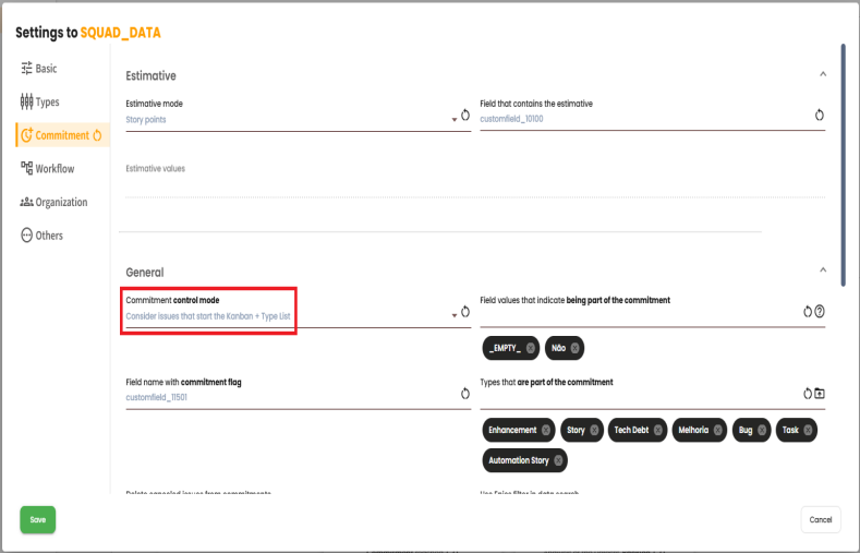
It is also necessary to define in the settings the field "Issue status that initiates the Kanban commitment,".
(C÷D x 100)÷10
C = Quantity of items delivered within the Process Time percentile (Commitment Fulfilled) D = Quantity of items delivered in the current period (Completed Issues)
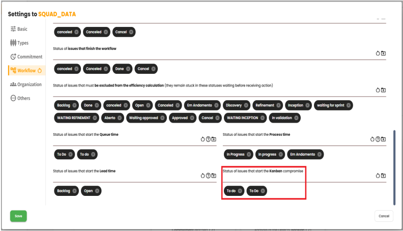
With these settings configured, the calculation can be performed. Taking the example shown in the image, all issues that pass through the "To do"or "To Do"statuses within the selected period will be considered as Estimated Commitment. Meanwhile, all issues completed within the period will be considered as Delivered Commitment issues. We can then use the calculation shown below to determine the achieved commitment indicator.
(C÷D x 100)÷10
C = Commitment DELIVERED D = Commitment ESTIMATED
Analysis of the Defects’ Backlog
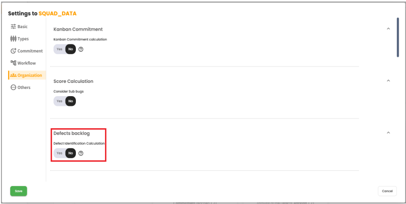
This indicator ranges from 0 to 10 and aims to measure how healthy the product backlog is in relation to defects (Bugs). This score can be calculated in two ways, and to choose between them, administrator permissions are required. To do so, you must go to the page Admin > Organizations > VSM Parameters under the Organization tab and modify the toggle button for Defects Backlog.
When the toggle is set to "no": The calculation will be composed of the analysis of 3 values:
- Defects in the team’s backlog not linked to the Sprint/Period. These are the BUGs in the backlog on the first day of the sprint/period.
- Defects created during the sprint/period not linked to the Sprint/Period. These are the BUGs created after the first day of the sprint/period.
- Defects under correction in the Sprint/Period. These are the BUGs being corrected during the sprint/period.
A forecast is made based on the current pace, projecting how many sprints/periods will be needed to clear the defects backlog (Bugs).
When the toggle is set to "yes": The calculation will be done as follows:
(100 - (((D+N)÷(E+N)) x 100))÷10
Where: D = Number of unresolved defects in the backlog N = Number of new bugs created during the period E = Total number of items delivered in the commitment
To validate the calculations, these values can be found under “Other Indicators.” To do so, they must be enabled in the settings on the sidebar.
Main Indicators
As the name suggests, the Main Indicators represent the most relevant and important indicators for the calculations and analyses conducted during sprints or work periods. This panel presents detailed information on various parameters, such as the total hours of items in Work and Wait, the planned Story Points, the average Lead Time, the average Queue Time, and other relevant indicators that the user configures to be displayed in the list.
Currently, this section offers almost 40 different indicators for analysis, providing a comprehensive and detailed view of the squad’s performance.
Commitment Indicators
The Commitment indicator refers to the squad’s ability to fulfill its promises and commitments within a work cycle, such as a sprint or period. It measures how much the squad has committed to the planned tasks and the effectiveness of delivering these items.
Commitment includes all the items that were proposed to be delivered during the sprint or period.
- Items that are part of the Sprint commitment.
- Items that pass through the status configured as the commitment status.
In the Metrics module, it is possible to configure the VSM to define the commitment, considering three different options:
- 1. Only the list of types: The commitment is determined solely by the type of items configured in the "Types that are part of the commitment"field.
- 2. Consider Flag and list of types: Commitment is determined by the list of types combined with a code from a specific field in the management platform. This code needs to be configured in the "Field name with the commitment flag"field.
- 3. Consider Kanban start list and list of types:
- The commitment is determined by the status list starting with the status configured in the "Issue status that starts the commitment in Kanban"field.
- Combined with the type of items configured in the "Types that are part of the commitment"field.
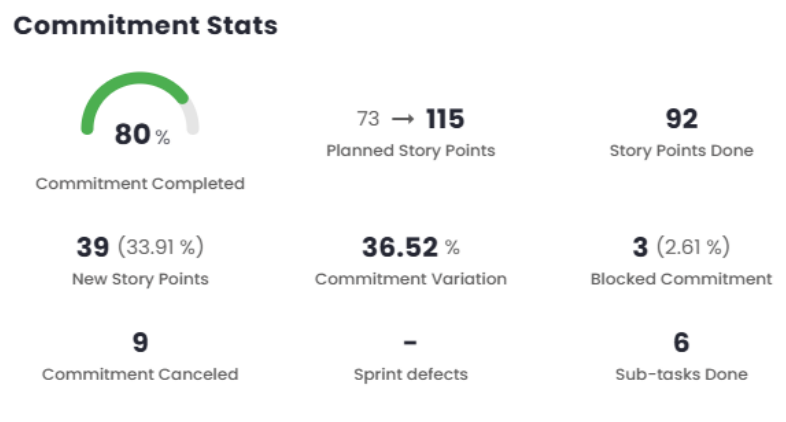
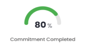
Commitment Completed
This field measures, in percentage, the completion of items that are part of the commitment for the sprint or period.
To do this, two pieces of data are retrieved from the management platform:
- The total estimated effort accounted for in the commitment when the sprint or period ended (Total).
- The total estimated effort completed in the commitment during the sprint or period (Completed).
With both pieces of data retrieved, the following calculation is performed:
(Completed÷Total) x 100
Commitment Completed = (92÷115) x 100
Commitment Completed = 80
Current Commitment
This field indicates the current estimated commitment in the case of Story Points, Relative, or, in the case of ticket counts, it shows the items that entered the commitment. When the estimation is in Story Points or Relative, this indicator displays the estimation variation of the commitment items in the sprint/period through two pieces of data:
- Initial Planned: The sum of the original story points or relative for all the items in the current commitment of the sprint or period.
- Final Planned: The sum of the current story points or relative for all the items in the current commitment of the sprint or period.
For better understanding, see the hypothetical example below:
A sprint starts with 21 points with the following stories: A (8), B (8), and C (5).
After the sprint starts, the following events occur in the following order:
- Story D is added with 3 points.
- Story A is changed to 13 points.
- Story D is changed to 5 points.
With this, the planned story points/effort indicator will display:
24→31
where:
24 = A (8) + B (8) + C (5) + D (3)
31 = A (13) + B (8) + C (5) + D (5)
No additional calculations are performed. Estimates (Story Points/Relative): Regarding this indicator, when the estimates are Story Points or Relative, the following clarification is important: For both pieces of data, the items currently in the sprint are considered, regardless of whether they were in the sprint from the beginning or were added later. For this reason, the first data point should not be confused with the amount of story points or relative that existed when the sprint started.
To calculate the percentage, we need the following data – already covered:
- Sum of estimates/items added to the commitment after the start of the sprint or period (New).
- Sum of current estimates/items for all items in the current commitment for the sprint or period (Final Planned).
A sprint starts with 21 points with the following stories: A (8), B (8), and C (5).
After the sprint starts, the following events occur in the following order:
- Story D is added with 3 points.
- Story A is changed to 13 points.
- Story D is changed to 5 points.
With this, the planned story points/effort indicator will display:
24→31
And the new story points/effort indicator will display:
10 (32.25%)
Where:
10 = (31 – 21)
32.25% = (10÷31) x 100

Completed Commitment
This indicator displays the value of the completed commitment, i.e., the sum of all the estimates/items completed in the commitment during the sprint or period. This data is retrieved from the management platform. No additional calculations are performed. Estimates/items:
- Estimates when Story Points or Relative are used.
- Items when Ticket Count is used.

New Commitments
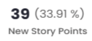
This indicator measures the number of estimates/items added to the commitment after the sprint or period has started. Two correlated pieces of data are displayed:
- Sum of estimates/items added to the commitment after the start of the sprint or period (New).
- Percentage of estimates/items added to the commitment after the start of the sprint or period in relation to the total number of estimates/items in the commitment for the sprint or period.
While the first value is retrieved from the management platform, the second is obtained through a simple percentage calculation.
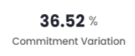
Estimate Variation – Estimates (Story Point/Relative)
This indicator measures the variation in the estimated story points/effort planned, which — just to remind you — are:
- Initial Planned: The sum of the original story points/effort for all items in the current sprint or period’s commitment.
- Final Planned: The sum of the current story points/effort for all items in the
current sprint or period’s commitment.
With both sets of data available, the difference (Variation) between them is calculated, and then the following calculation is performed:
(Variance÷Final Planned) x 100
Variance = 115 – 73
Variance = 42
Estimate Variance = (42÷115) x 100
Estimate Variance = 36.52
Blocked Commitment
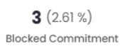
This indicator measures the number of estimates/items currently blocked within the commitment.
Two related data points are displayed:
- Sum of estimates/items currently blocked in the commitment during the sprint or period (Blocked);
- Percentage of blocked estimates/items relative to the total number of estimates/items in the commitment during the sprint or period.
While the first value is retrieved from the management platform, the second is obtained through a simple percentage calculation.
To calculate the percentage, the following data is needed:
- Sum of estimates/items currently blocked within the commitment (Blocked);
- Sum of estimates/items for all items when the sprint or period ended (Final Planned).
(Blocked÷Final Planned) x 100
Blocked commitment = (3÷115) x 100
Blocked commitment = 2.61
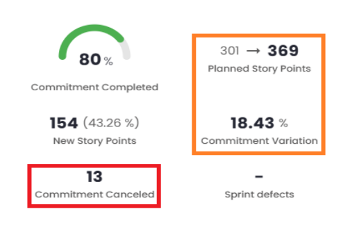
Cancelled Commitment

This indicator measures the quantity of estimates/items that have been cancelled within the commitment, i.e., the sum of the estimates/items for the cancelled items in the commitment during the sprint or period.
This data is retrieved from the management platform, but its visibility depends on the VSM configuration "Exclude cancelled issues from the commitment."
The configuration offers two options:
- 1 - When configured not to consider cancelled items in the commitment, the indicator will display “-”.
- 2 - When configured to consider cancelled items in the commitment, the indicator will display the sum of the cancelled estimates/items.
Regarding the VSM configuration for considering or not considering cancelled items as part of the commitment, it is important to note that it also alters the number of planned estimates/items—and consequently all the indicators that depend on it.
See the examples below:
- 1 - If cancelled items are not considered, we have a total of 356 planned story points.
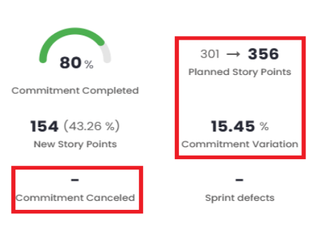
- 2 - Cancelled items are considered (13), and we have a change in the total number of planned story points (369 = 356 + 13), which also causes a change in the estimate variation.
Sprint/Period Defects

This indicator shows the number of defects opened during the sprint/period, also known as story-bugs or sub-bugs. This data is retrieved from the management platform and then presented according to the VSM configuration, specifying which types should be treated as story-bugs. No additional calculations are performed.
Completed Sub-tasks

This indicator shows the number of sub-tasks completed during the sprint or period. This data is retrieved from the management platform and then presented according to the VSM configuration, specifying which types should be treated as sub-tasks. It is important to note that this indicator does not consider whether the sub-tasks are part of the commitment or not.
Other Indicators
The Other Indicators, represent complementary metrics to the Main Indicators. Some of these indicators are present in both dashboards. This panel displays various information related to specific parameters, serving as a complement in case they are not included in the Main Indicators.
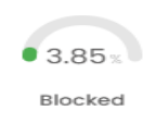
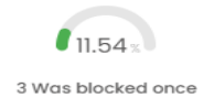
Issues – Blocking and Efficiency
This panel provides a detailed view of the blocking and efficiency rates that make up the overall score of the sprint or period under analysis, offering a clear insight into performance and related metrics.
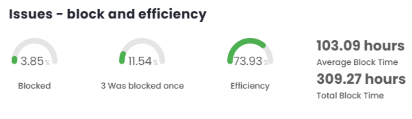
Percentage of Blocked Items
This indicator measures, as a percentage, how many items are currently blocked in the sprint or period.
To calculate this, two pieces of data are retrieved from the management platform:
- The number of items currently blocked in the sprint or period (blocked);
- The total number of items in the sprint or period (total).
Currently, for sprints or periods that have already ended, it is assumed that the task remained blocked until the moment of its closure.
With both pieces of data retrieved, the calculation is then performed as shown below:
(Blocked÷Total) x 100
Blocked = (1÷26) x 100
Blocked = 3.85
Percentage of Items That Were Blocked
This indicator measures, in percentage terms, the number of items that were blocked at some point during the sprint or period under analysis.
To calculate this, two pieces of data are retrieved from the management platform:
- Number of items that were blocked during the sprint or period (blockages);
- Total number of items in the sprint or period (total).
With both pieces of data retrieved, the calculation is then performed as shown below:
(Blocks÷Total) x 100
% Blocks = (3÷26) x 100
% Blocks = 11.54
Efficiency Percentage
This indicator measures efficiency based on the time spent on value-adding stages, compared to the time spent on non-value-adding stages.
To calculate this, the following three pieces of data are retrieved from the management platform:
- Time spent in all ’WAIT’ statuses;
- Time spent in ’WORK’ and ’WAIT’ statuses;
- Time during which items were blocked in ’WORK’ status.
Once the data is retrieved, the calculation is performed as shown below:
(100 - ((A+C)÷(B+C) x 100))÷10
A = Time all statuses were in ’WAIT’ B = Time all statuses were in ’WORK’ and ’WAIT’ C = Time items were blocked in ’WORK’ status
(100 - ((1756.38+309.27)÷(8092.87+309.27) x 100))÷10 = 7.39
A = 1756.38 hours (Wait) B = 8092.87 hours (Work/Wait) C = 309.27 hours (Blocked in Work)
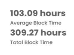
Blocking Time
This section presents two indicators related to blocking and process efficiency:Total Blocking Time and Average Blocking Time.
- Total Blocking Time: Refers to the absolute sum of the time items were blocked, with no additional calculations.
- Average Blocking Time: Calculated by dividing the total blocking time by the number of blocked items. In the example illustrated below, three blocked items are considered, so the total blocking time is divided by three, resulting in the average blocking time per item.
The following image complements this explanation, illustrating the application of the indicators mentioned.
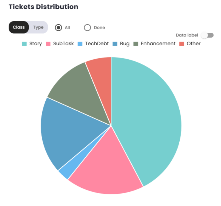
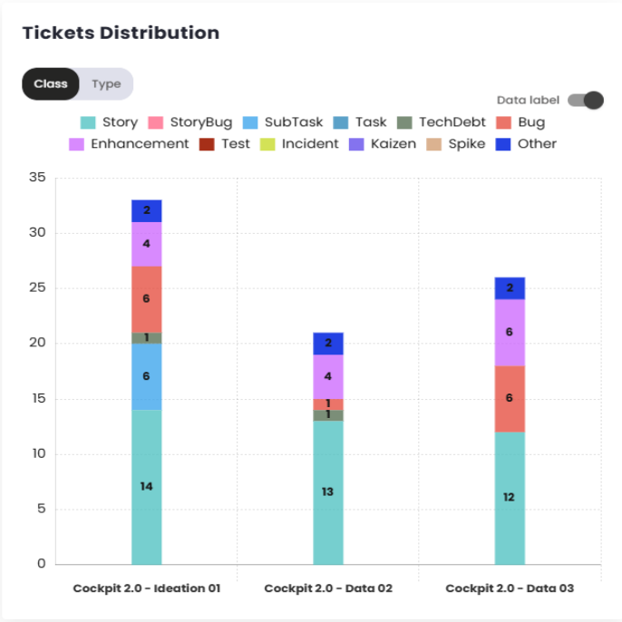
Ticket Distribution
This chart provides a view of which tickets entered the selected sprint/period. It allows a breakdown of tickets by class and type, in addition to offering the option to filter for completed tickets only or view all tickets.
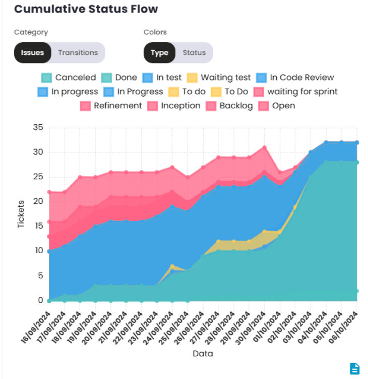
Cumulative Flow of Status
The Cumulative Flow Diagram (CFD) or Cumulative Flow of Status indicator is a visual tool used to monitor the progress of a project over time. It helps visualize the status of work at different stages of the process, making it easier to identify issues and optimize workflow.
By observing the size of the areas on the graph, it’s possible to identify where work is accumulating. A significant increase in one area indicates a bottleneck, where tasks are being held up and not progressing to the next phase. The "Done"area should gradually increase, indicating that the team is delivering work as planned.
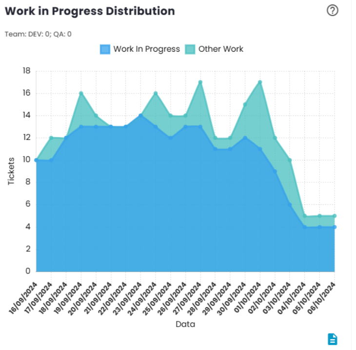
Distribution of Work in Progress
The Distribution of Work in Progress chart provides a clear view of the amount of work the team is handling at a given moment. Ideally, the volume of work should be aligned with the team’s delivery capacity, allowing members to focus on tasks without the need for frequent context switching.
The recommendation is that the number of tickets in progress should be approximately equal to the number of team members. When the volume of tickets exceeds the number of team members, there is a risk of the team becoming simultaneously involved in multiple tasks, which can lead to efficiency loss due to constant focus switching.
On the other hand, when the number of tickets in progress is lower than the number of team members, this may indicate that some members are not able to work independently on tasks, possibly due to a lack of demand and/or an imbalanced distribution of work.
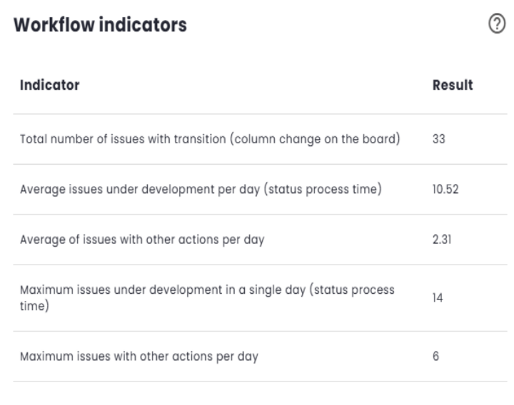
Workflow Indicators
Workflow Indicators are used to assess whether the volume of work in progress is appropriate for the team’s capacity. The goal is to ensure that the team has a workload aligned with its delivery capacity, maximizing efficiency and minimizing waste.
- Excessive Work in Progress: A high number of tasks simultaneously in progress can indicate that the team is spending too much time switching contexts between activities, which tends to result in a loss of efficiency due to the time spent switching between tasks.
- Insufficient Work in Progress: When the volume of work is low, it may indicate that the team does not have enough refined or ready-to-execute demand, which can affect productivity and delivery pace.
These indicators help identify imbalances in the workflow, enabling adjustments that promote more efficient and continuous delivery.
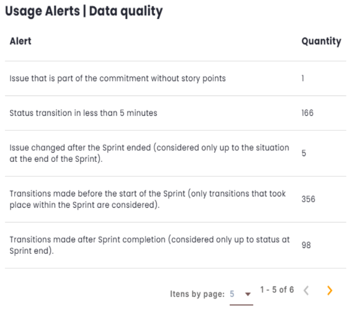
Usage Alerts | Data Quality
This section displays Usage Alerts related to Data Quality during issue transitions between different statuses in the management tool. The goal is to monitor the consistency and accuracy of data, ensuring that the information recorded remains correct throughout the process.
The alerts identify potential inconsistencies or inaccuracies in the data, helping to ensure that the workflow is accurately reflected in the tool. They also allow for quick corrective actions to maintain data integrity.
Hours by Status (in %)
This indicator calculates the proportion of hours associated with each status in relation to the total hours of the type to which the status belongs. Work-type statuses are proportional to the total work hours, while wait-type statuses are proportional to the total wait hours.
This metric allows tracking the distribution of time across different workflow states, making it easier to analyze efficiency and resource allocation.
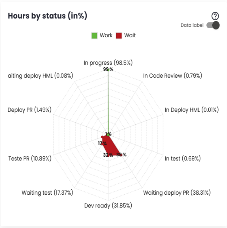
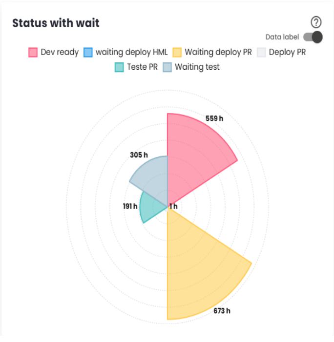
Wait Statuses
Wait statuses refer to situations where tickets are waiting for the team’s action. The longer the time spent in these statuses, the lower the team’s efficiency indicator will be. The following chart shows the times corresponding to each status. The largest representation of a status in the chart indicates its significant contribution to increasing the issue delivery time and, consequently, reducing team efficiency.
If a work status is displayed in the chart, it should be included in the "Issue Statuses That Generate Value (Work)"configuration so that it is considered part of the actual work, positively impacting the efficiency index. On the other hand, if a status does not represent a work phase but rather a situation where the demand is not yet ready to be addressed (e.g., not prioritized, not in the queue), this status should be included in the "Issue Statuses to Exclude from Efficiency Calculation"configuration, so that it is not counted in the efficiency calculation, as it does not reflect activities directly related to the delivery process.
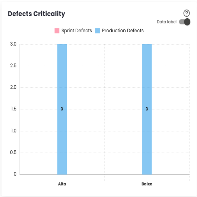
Defect Severity
The "Defect Severity"dashboard provides an overview of defects identified during the development of the Sprint/Period and after delivery.
Sprint Defects are errors detected during the implementation of user stories or subtasks within the Sprint, classified, for example, as Story Bug or Story Bug - Sub-task. These defects are directly related to the development process.
Production Defects, on the other hand, are issues that arise in the production environment after the Sprint is completed, typically classified as Bug, for instance. These defects usually indicate problems that were not identified before delivery and can impact the end-user experience.
The distinction between these types of defects allows for effective tracking of quality during both the development cycle and the system’s operation.
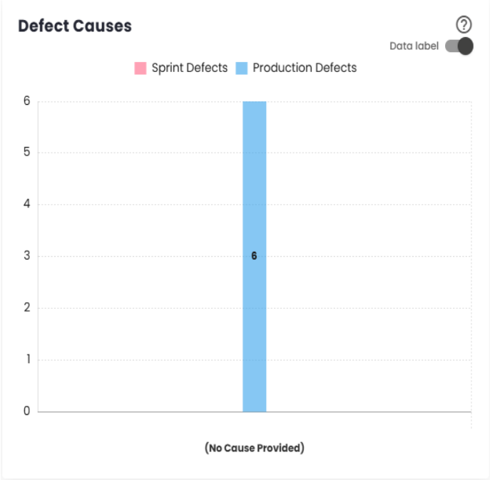
Defect Causes
This is a complement to Defect Severity, providing detailed information on the causes of defects, both during the Sprint or period and after delivery.
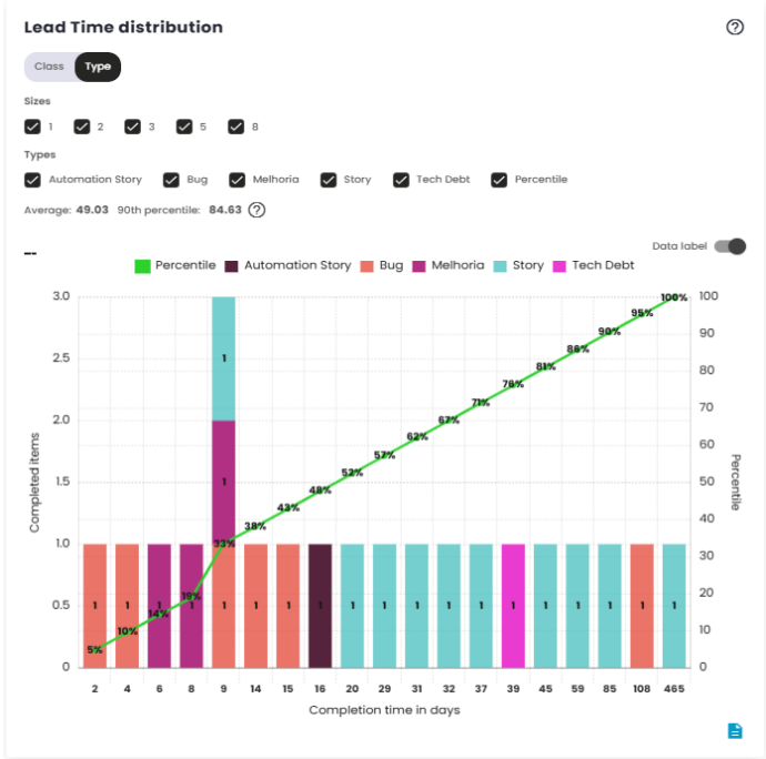
Lead Time Distribution
Lead Time is the total time between the creation of an issue and its completion. It measures the efficiency of the delivery process, indicating how long it takes for the team to turn a demand into a finished delivery.
The Lead Time measurement starts at the moment the issue is created or at another configured event, such as when it enters a work status, and ends when the issue is completed. The platform used to manage the workflow can be configured to adjust these start and end points, directly impacting the Lead Time measurement.
This metric is essential for evaluating team performance and identifying potential bottlenecks or areas for improvement in the development process.
The distribution chart shows how Lead Time values are spread over a specific time range. It groups the data into classes or categories and displays the frequency with which those intervals occur. This helps visualize the overall behavior of Lead Time, identifying trends such as whether most issues are completed in a shorter or longer time. It provides a useful representation to understand the overall shape of delivery time distribution and evaluate the consistency of the process.
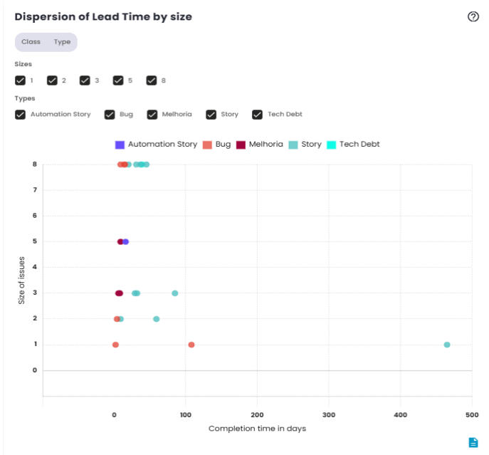
Lead Time Dispersion by Size
As mentioned earlier, Lead Time is the metric that measures the time between the creation and completion of an issue. The main difference between the two charts lies in how the data is represented. The first chart shows the distribution of Lead Time, while the second chart displays the dispersion of the data.
The scatter plot, as the name suggests, visualizes the individual variation of Lead Time values over time. Instead of showing an aggregated distribution, it presents each data point in isolation, allowing for a clearer identification of cases that fall outside the average or exhibit significant variations. This type of chart is useful for analyzing patterns and identifying issues that took longer than expected to be completed.
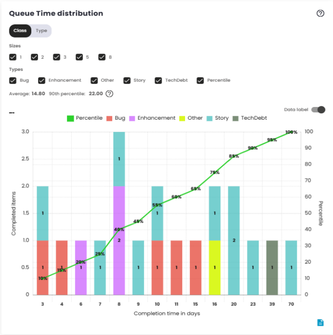
Queue Time Distribution
Queue Time is the elapsed time between when an issue enters a status indicating it has been prioritized or selected to be worked on, and when it is completed. This metric reflects the time a demand spends "waiting"or "in the queue"before it is actually processed, measuring the efficiency of prioritization and resource allocation.
Queue Time begins when the issue enters a specific configured status, such as "To Do"or "Ready for Work,"or any other status set as the starting point. It ends when the issue is completed or moved to the "done"status.
Like Lead Time, Queue Time can be adjusted based on the platform’s configuration, influencing how the wait time is calculated. This metric is crucial for understanding how long issues wait before being worked on, offering critical insight into the efficiency of the prioritization process.
The Queue Time distribution chart shows the variation in wait time for issues within a specific time interval. It groups the data into time ranges and shows the frequency with which different Queue Time intervals occur. This allows for visualizing the distribution of wait times, identifying patterns and potential bottlenecks in the prioritization or selection phase. This analysis helps determine if there are issues with the speed at which tasks are started and whether the resource allocation process is working efficiently.
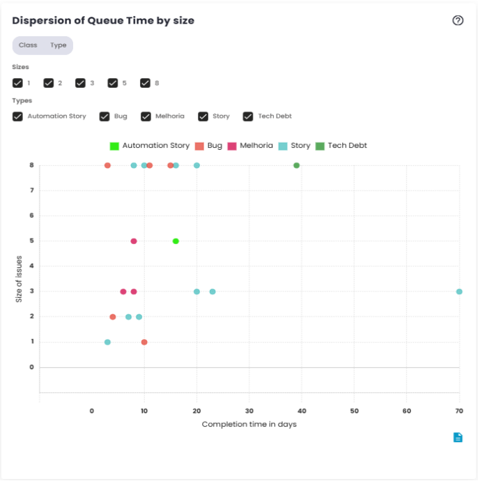
Queue Time dispersion by size
The Queue Time scatter plot shows the individual variation in wait times for issues before they are started. Rather than grouping the data, it displays each data point separately, making it easier to identify cases with unusually high wait times.
This chart is useful for detecting patterns or outliers, such as issues that spent an excessive amount of time waiting to be started. It provides a clear view of the consistency and agility of the workflow, helping to identify areas that may need adjustments.
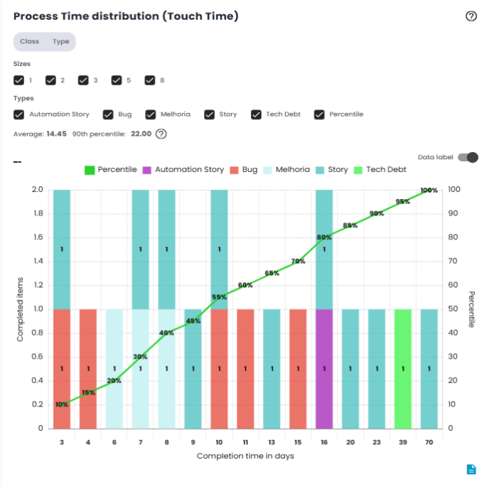
Process Time Distribution (Touch Time)
Process Time is the metric that measures the time between the actual start of work on an issue and its completion. This time reflects how long the team takes to directly work on the task, from the moment it begins to be processed until its final delivery.
The Process Time distribution chart displays how work times are distributed within a specific time range. It groups data into time classes, allowing you to visualize the frequency with which different Process Time intervals occur.
This chart is useful for understanding the overall behavior of issue processing times, indicating whether most tasks are being completed quickly or if there is a trend of delays in certain cases. Additionally, it helps identify patterns in team performance, such as consistency in execution times or potential variations due to specific factors.
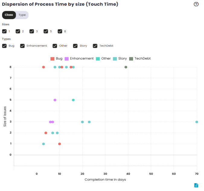
Process Time Dispersion by Size (Touch Time)
The Process Time dispersion chart shows the individual variation of issue processing times over time. Instead of grouping the data, it displays each Process Time value separately, which helps identify cases with unusually long or short processing times. This chart is useful for spotting outliers, such as issues that took longer than expected to complete. It helps visualize cases where work on an issue may have faced interruptions or delays, and highlights the variability in team performance. Analyzing these isolated points provides a detailed view of the execution process’s efficiency and can point to areas that need adjustments to improve agility and consistency.
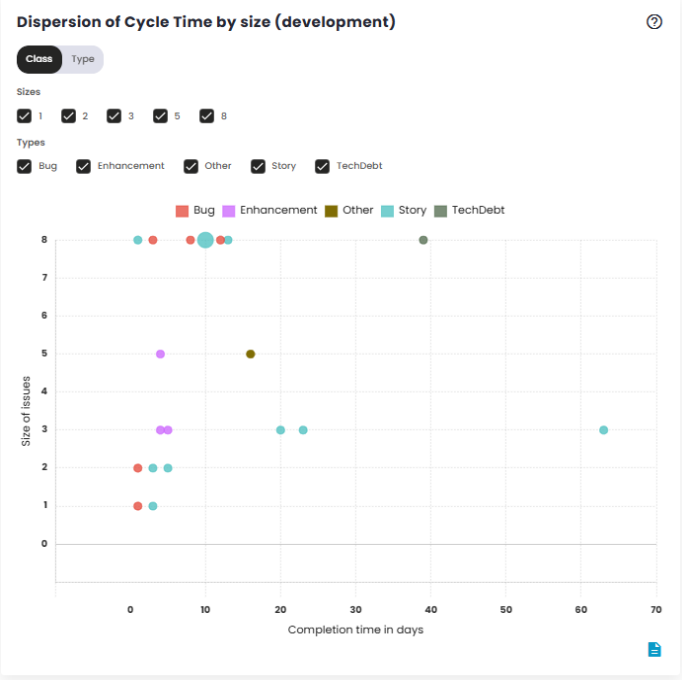
Cycle Time Distribution by Size (Development)
Cycle Time measures the time an issue spends in the development stage, from the start of active work to its progression to the next stage, such as transitioning to testing, for example. This time reflects the effort required to move the demand through the build process, excluding waiting time or the completion phase. The Cycle Time distribution graph by Size shows how development times vary according to the size or complexity of issues. It groups the data into time intervals, allowing you to see the frequency with which issues of different sizes are completed within a given cycle time. This graph is useful for analyzing how Cycle Time behaves in relation to task size. It can reveal whether more complex or larger issues take longer to develop or if there is variability in cycle time based on complexity. This helps the team understand the relationship between task size and development process efficiency, enabling the identification of areas for improving resource allocation or time estimation for different types of tasks.
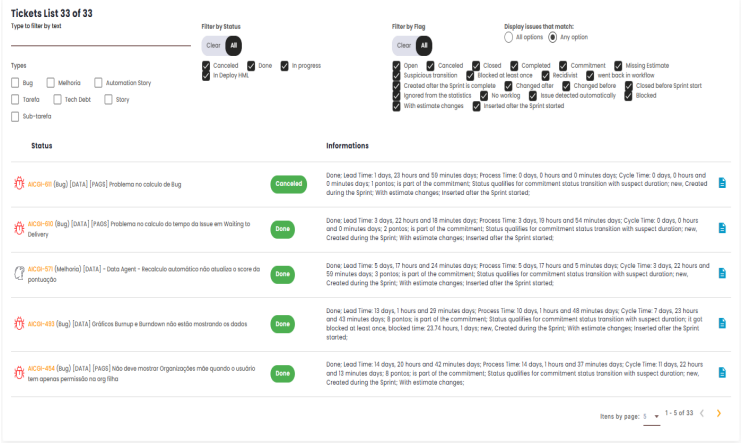
Tickets List
The main goal of the Ticket List is to provide a comprehensive breakdown of the issues addressed during the work cycle (sprint or specific period), making it easier to analyze team performance, track tasks, and visualize the current state of each item. From this list, it’s possible to get a detailed view of the progress of each ticket, identify potential blockers, review the history of status changes, and other details related to its execution.
Panel features
The Ticket List includes several relevant pieces of information about the issues during the period or sprint, such as:
- Ticket ID: Displays the unique identifier for each issue. Clicking on the ID will redirect the user to the source tool (issue management platform) for more details or to perform additional actions.
- Issue Status: Shows the current status of each issue, indicating where it stands in the workflow (e.g., "In Development", "In Testing", "Approval", "Completed", etc.).
- Time Spent in Each Status: Displays the total time each issue remained in each status during the sprint period, helping to identify potential bottlenecks in the workflow.
- Owner: The platform indicates which team member is responsible for each task. This helps in tracking individual workloads and analyzing task distribution.
- Creation and Completion Dates: Displays the creation and completion dates for each ticket, enabling a deeper analysis of the task execution time and efficiency throughout its lifecycle.
- Issue Type: This could include bug, enhancement, technical task, among others, aiding in categorization and analysis of specific demand types within the sprint.
Filters and Search
The Ticket List provides the option to use filters to refine searches and quickly locate specific information. These filters can be applied based on several criteria, such as:
- Status Filter: Filters tickets by specific status to view only those at particular stages of the process.
- Indicator Filter: Filters by issue indicators, such as "open", "cancelled", "completed", etc.
- Text Filter: Filters issues based on text entered in the filter field.
How to Use
- When viewing the Ticket List, use the available filters to refine your search according to your needs.
- Click on the Ticket ID to be redirected to the source tool, where you can view more information.
- Use the list to track the progress of each ticket and identify areas that may need attention, such as tickets that are taking longer than expected to complete or those that are blocked at a specific status.
Benefits
- Visibility and control: Provides a clear, detailed view of all issues worked on during the period or sprint, allowing managers to track activity progress in real-time.
- Performance analysis: By examining information about time spent in each status and the responsible team members, potential areas for improvement can be identified, such as workflow bottlenecks or imbalances in task distribution.
- Easy tracking: With the ability to filter and search for specific issues, the list becomes a practical tool for tracking and managing the team’s progress without information overload.
Totalization of transitions by status
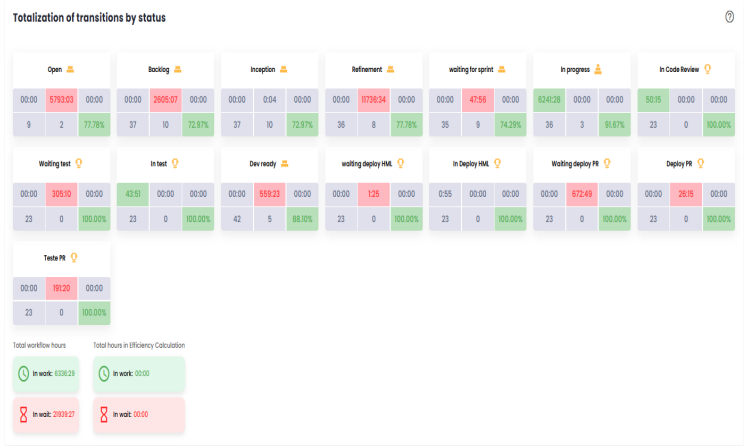
This section provides a detailed view of the status transitions of issues throughout the workflow, offering insights into the time spent at each stage and the team’s performance. It includes several key metrics that help monitor and analyze process efficiency, identify bottlenecks, and assess the impact of rework on delivery. Below are the main components of this panel:
- In Progress/Adding value (hours): This metric tracks the number of hours that issues spend in "In Progress" status, meaning when the team is actively engaged in tasks such as coding or testing. This time is considered "adding value" because it represents the period in which the team is directly contributing to the delivery progress.
- Waiting/Waste (hours): This metric counts the hours that issues remain in waiting statuses, such as "Waiting for deploy" or "On hold". These statuses are considered waste because they represent periods when the issue is not being actively worked on. The goal is to reduce this time, as eliminating these waiting periods would shorten the overall delivery time.
- Effort (worklog): Refers to the hours that the team logs in the issue management platform under the worklog field, representing the actual time spent working on the issues. These hours indicate the team’s effort in developing the tasks and are an important metric for measuring workload and team commitment.
- Total occurrences: This indicator shows the total number of issues that passed through a specific status during the analyzed period. It helps to understand how often issues transition through particular stages of the process, highlighting which phases have the highest volume of transitions.
- Repetition - Ticket returned to status: Refers to issues that have returned to a previously reached status. For example, an issue that was moved to "In Testing" but later returned to "Development" for adjustments and then went back to "In Testing". The repetition metric helps identify potential rework or validation cycles that may signal inefficiencies or unclear requirements.
- Percentage of Completed Tickets (without rework): This indicator shows the total number of issues that passed through a specific status and the percentage of those that did not require rework. In other words, it shows the proportion of issues that transitioned through the status in a linear way, without needing to return to earlier phases. This percentage is important for evaluating the quality of work and the efficiency of the delivery flow, as a low percentage of completed tickets could indicate issues with quality or review and validation processes.
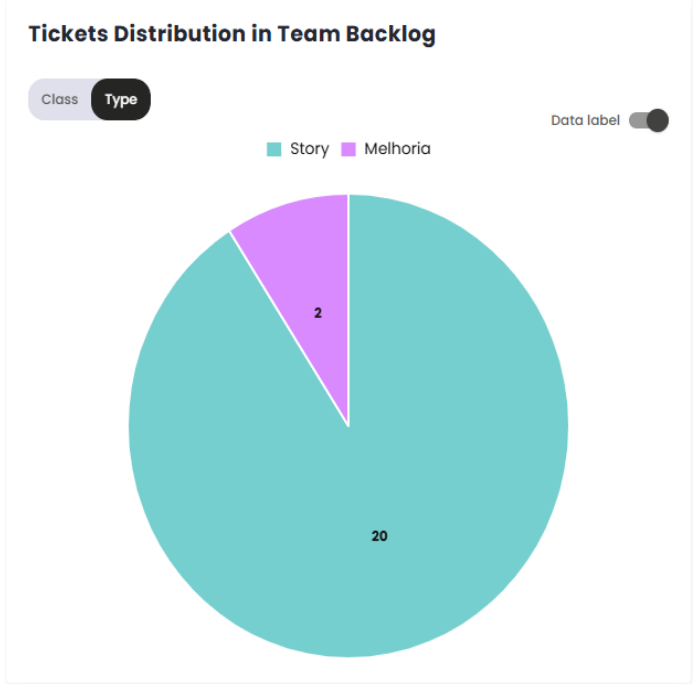
Distribution of Tickets in the Team’s Backlog
The Ticket Distribution in Team Backlog indicator is a critical metric for monitoring the organization and prioritization of tasks and requests within the backlog. It provides a clear view of the allocation and balance of demands, helping to identify patterns and potential bottlenecks in work management.
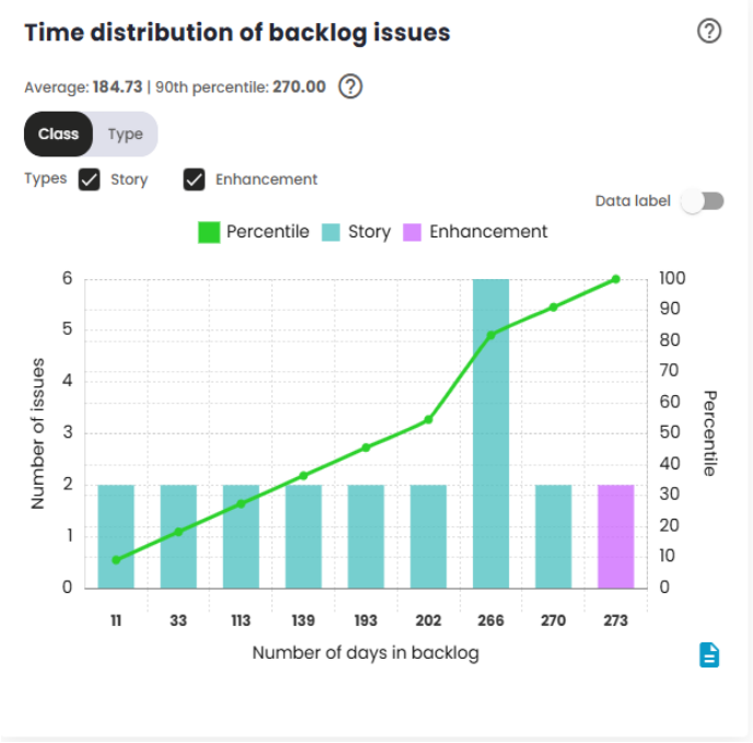
Time distribution of backlog issues
The Issue Time Distribution in Backlog indicator measures the time elapsed between the creation of an issue and the start of the Sprint/Period in which it is actually worked on. This indicator is crucial for analyzing the amount of time issues spend in the backlog before being prioritized and included in a Sprint/Period.
Backlog Analysis
This indicator ranges from 0 to 10 and aims to measure the health of the product and sprint/period backlog in relation to production defects (bugs). The score will be low if a team has many defects in the product backlog, generates a significant number of defects during a sprint or period, and is unable to fix defects in a sustainable manner. The score will be high if the team has few defects in the product backlog, generates few defects during a sprint or period, and is able to fix more defects than it generates.
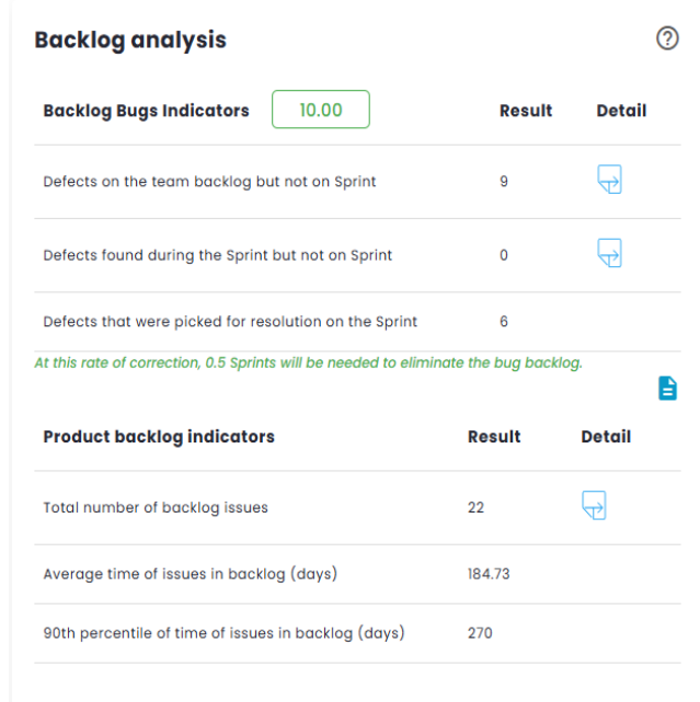
Standard Calculation:
This calculation determines how many Sprints/Periods are required to clear the defects backlog, using the formula:
Sprints/Periods = (Old + New)÷(New - In Progress)
With Old = 0, New = 2 and In Correction = 3:
Sprints/Periods = (0 + 2)÷(2 – 3) = -2
If Sprints/Periods < 0 or > 12, the score is 0, If Sprints/Periods < 2, the score is 10.
For other cases, the score is calculated as:
Score = 10 - (Sprints/Periods - 2)
If Sprints/Periods = 2: Score = 10 - (2 – 2) = 10
Weighted calculation:
The system assigns different weights to defects based on their current status and criticality:
- Situation: The list of situations is fixed (three), and each situation is a separate indicator.
- Criticality: The list of criticalities is dynamic and configurable in the organization’s registration.
Data Recovery:
- From the management tool: Total number of defects and defects by criticality.
- From the organization’s registration: Criticality weights and indicators.
Example: Weighted Quantity:
Weighted Quantity = Í (Quantity×Weight C)
Weighted Total:
Weighted Total = Weighted Quantity x Weight I
With the weighted indicators calculated, the final score is determined from the total field of each indicator. For the standard calculation, the total of each indicator is used, while for the weighted calculation, the weighted total is used.
Weights:
- The weights for situations and criticalities are configurable, with default values suggested by the system.
- If a criticality is not configured, its weight will be 1.
- For the standard calculation, all weights are equal to 1.
Indicators:
- In backlog outside the sprint/period: Defects created before the sprint, outside the sprint backlog.
- Created during the sprint/period and outside the sprint/period: Defects created during the sprint/period, but outside the sprint backlog.
- Under correction in the sprint/period: Defects that are in the sprint/period backlog.
Example of Weighted Calculation:
If we have: Old = 192 New = 0 Under Correction = 272
The total would be:
Total = 192 + 0 + 272 = 464
And the weighted score calculation would be:
Formula = (Under Correction Total÷Total) x 2 x 10
Score = (272÷464) x 2 x 10 = 10
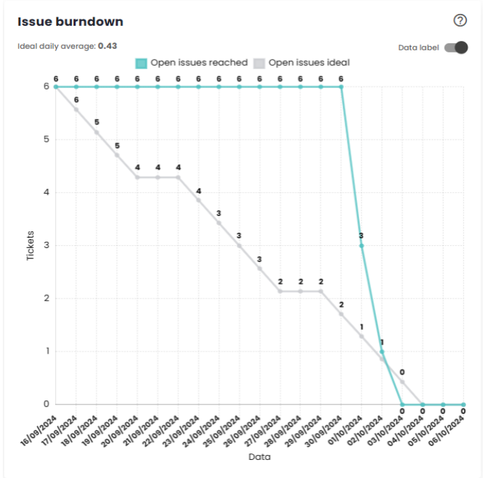
Issue Burndown
The Burndown Chart is a visual representation of the remaining work versus the time available, used to monitor the team’s progress throughout a sprint/period. The Ideal open work line indicates the amount of work that should remain pending at each point in time to ensure that all planned work is completed by the end of the Sprint/period. The Actual open work line represents the real amount of work still open at any given moment.
When the actual line is above the ideal line, it means the team is "behind" the target. In this case, corrective actions should be taken to recover lost time and bring the actual line closer to the ideal line. If the actual line is below the ideal line, it means the team is "ahead"of the plan. In this scenario, measures should be taken to prevent the team from being idle until the end of the Sprint/period, ensuring continuous work and optimization of time.
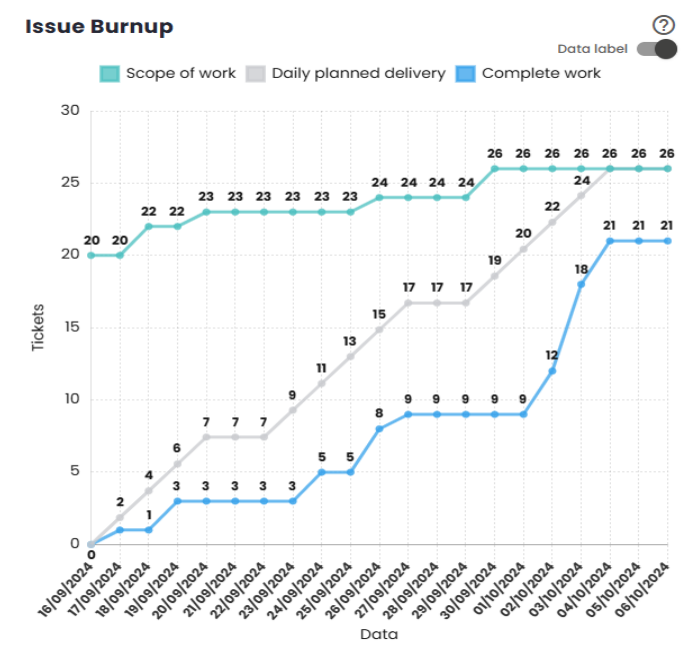
Issue Burnup
The Burnup Chart provides a visual representation of the work completed during a Sprint/period, compared to the total planned scope. It allows tracking the team’s progress toward completing the Sprint/period and identifying potential issues related to scope changes during the cycle.
The vertical axis of the chart represents the total work for the Sprint/period, usually measured in the number of tasks or points. The horizontal axis reflects the passage of time throughout the Sprint/period, typically in days. The gray diagonal line across the chart represents the ideal progress toward completing the work over time. The blue line indicates the actual work completed, while the green line shows the number of issues still open.
As work progresses, the blue line should closely follow the gray diagonal line (ideal progress), ensuring that the Sprint/period goal is achieved by the end. Additionally, the green line should steadily decrease, indicating that the number of open issues is being reduced over time.
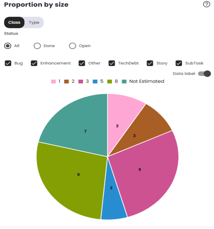
Proportion by size
This chart displays the distribution of issues in the Sprint according to their relative size, allowing you to visualize the proportion of work associated with different task size categories. If the "Completed"option is selected, the chart will only consider issues that are in the "Completed"status in the configuration—i.e., those that have already been finished and delivered according to the team’s/organization’s parameters. This feature allows you to specifically track the progress of completed issues within the Sprint, making it easier to analyze the work completed in relation to its size.
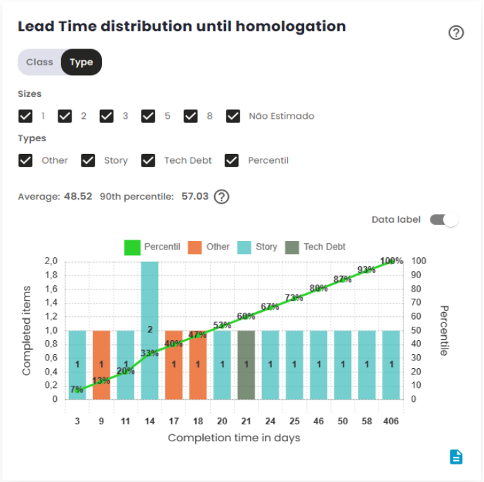
Lead Time distribution until homologation
The Lead Time to homologation measures the total time between the creation of an issue and its completion, i.e., until it reaches the "completed"or "homologated"status. This metric gauges the efficiency of the delivery process, indicating how long it takes for the team totransform a demand into a deliverable product ready for validation.
The Lead Time to homologation starts when the issue is created or from another configured event, such as entering a work status, and ends when the issue reaches the Homologation status, considered the final point of the delivery process. The platform used to manage the workflow can be configured to adjust these start and end points, which directly impacts how Lead Time is measured.
This metric is crucial for evaluating team performance and identifying potential bottlenecks or areas for improvement in the development process leading up to homologation, before the issue is actually delivered to the customer or stakeholders.
The Lead Time to homologation distribution chart shows how the values of this metric are distributed over a specific time period. It groups the data into time intervals or categories and displays the frequency with which these intervals occur. This chart allows you to visualize the overall behavior of Lead Time, identifying trends, such as most issues being completed in shorter or longer time frames before reaching the homologation status. The distribution helps analyze the consistency of the development process, providing insight into whether the time tohomologation is within expectations or if there are significant variations that warrant attention.
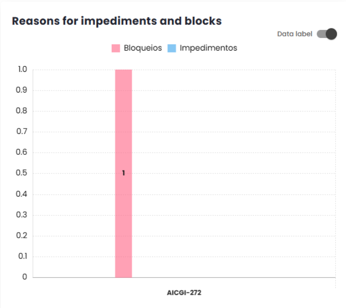
Reasons for impediments and blockages
The Blockage Metric is used to track and categorize the main reasons that cause stoppages or delays in the progress of activities. The goal of this metric is to identify and understand the factors that prevent the planned work from progressing, providing valuable insights for continuous improvement of the process and for the elimination or mitigation of obstacles in the workflow.
The impact of blockages directly affects the project’s delivery time: the more frequent and prolonged the blockages are, the longer it will take to complete the activities. Therefore, monitoring this metric is essential for improving team efficiency, fostering a more productive work environment, and reducing interruptions.By doing so, the team becomes more autonomous and better equipped to handle potential obstacles, enhancing the workflow and minimizing the negative impacts on the schedule.
Comparative Tab - Comparative Indicators
Insight Metrics
This modal has been developed to help users identify delivery deficits. It provides a comparison of data from multiple Sprints or Periods, eliminating the need to switch between tabs to access the information. Using artificial intelligence, the tool offers a clear view of what is improving or deteriorating within the team. These indicators help identify critical areas that need to be addressed, enabling the team to improve performance in future situations. In addition to showing a comparison between the selected Sprints/Periods, it provides transparency and greater control over the team’s progress.
After loading more than one sprint/period, it is possible to start the analysis.

In the image it is possible to observe that the Sprints/Periods are being processed by the artificial intelligence. This processing allows for a comparison and helps identify improvementsand performance gaps of the team. Within the AI Insights, the following points are covered:
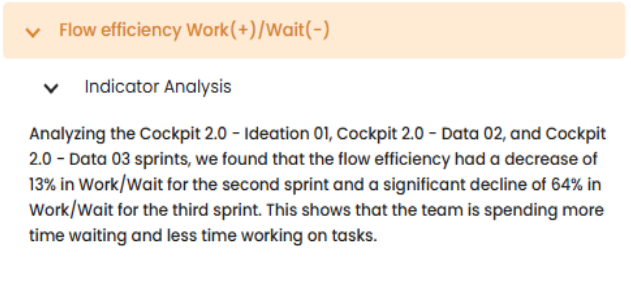
Work and Wait:
This insight presents a metric that allows evaluating the progress time in comparison to idle time. It analyzes the active time in previously loaded Sprints/Periods, as illustrated in the image below, which shows the percentage of improvement or deterioration during this interval. This analysis helps us better understand efficiency and productivity over time.
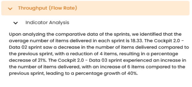
Throughput:
In this insight, the efficiency of deliveries is analyzed using Throughput, which measures the number of items completed in each period. By comparing the number of tasks finished across different time intervals, we can calculate an average of deliveries per iteration. This data is evaluated with the help of artificial intelligence, allowing for a comparison between the periods shown in the image below. This approach provides a detailed view of the production pace, highlighting the evolution and consistency of deliveries over time.
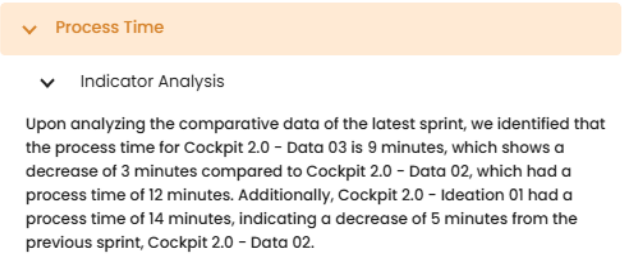
Process Time:
In this insight, we compare the efficiency of deliveries by using the difference between the initial and final times. With this, we calculate the average time for all completed tasks. This data will be analyzed using artificial intelligence, enabling a comparison between the periods shown in the image below. This approach provides us with a clearer view of performance and the evolution of deliveries over time.
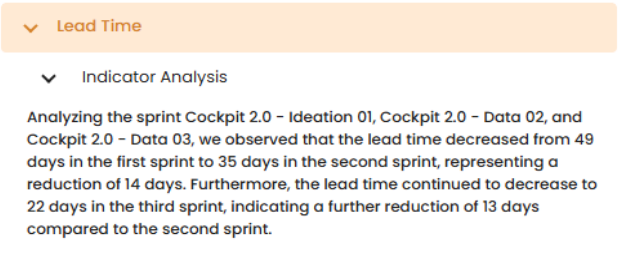
Lead Time:
In this insight, a comparative analysis is made of the time elapsed between an item’s entry into the upstream stages and its completion in the downstream stages in the production environment.
- Upstream: Refers to the set of stages that occur before the start of productive activities.
- Downstream: Encompasses the stages of development, execution, and/or production of the items.
This analysis allows us to identify opportunities for improvement and optimization in the workflow.
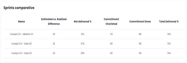
Sprint/Period Comparison
This table displays 5 key indicators: Estimated vs Actual Difference, % Not Delivered, Estimated Delivery, Actual Delivery, and % Total Delivered. As the name suggests, its purpose is to provide a comparison of these results across open sprints/periods without needing to switch between tabs.
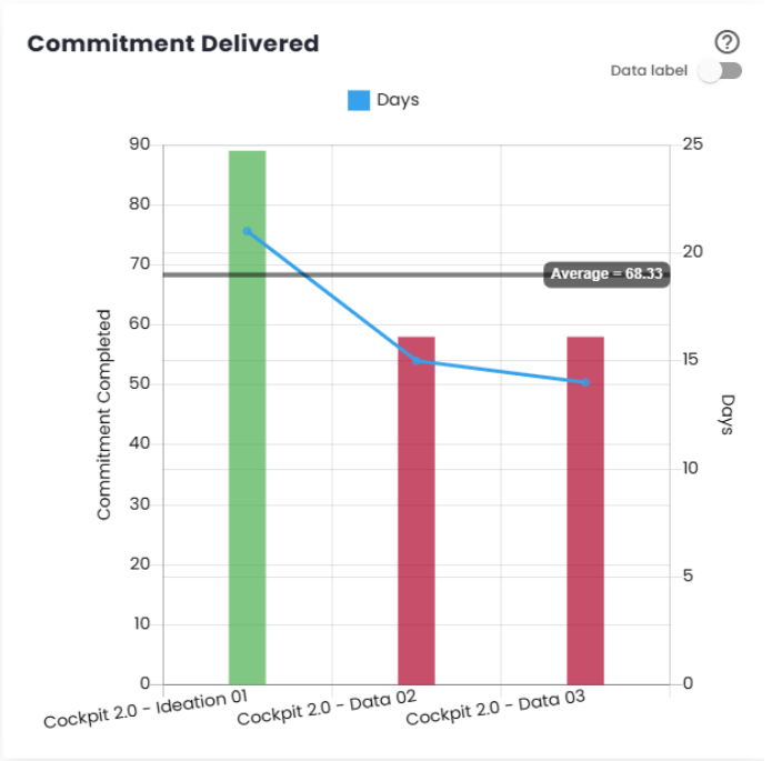
Delivered Commitment
The Delivered Commitment represents the
total number of story points or issues completed in each Sprint/Period. Configurations can vary between story points, ticket count, or relative measures. Changing these calculation settings may distort this view until a few sprints pass and stabilization occurs. It is important that this data accounts for the percentage of the commitment delivered to provide a clearer view of progress over time.
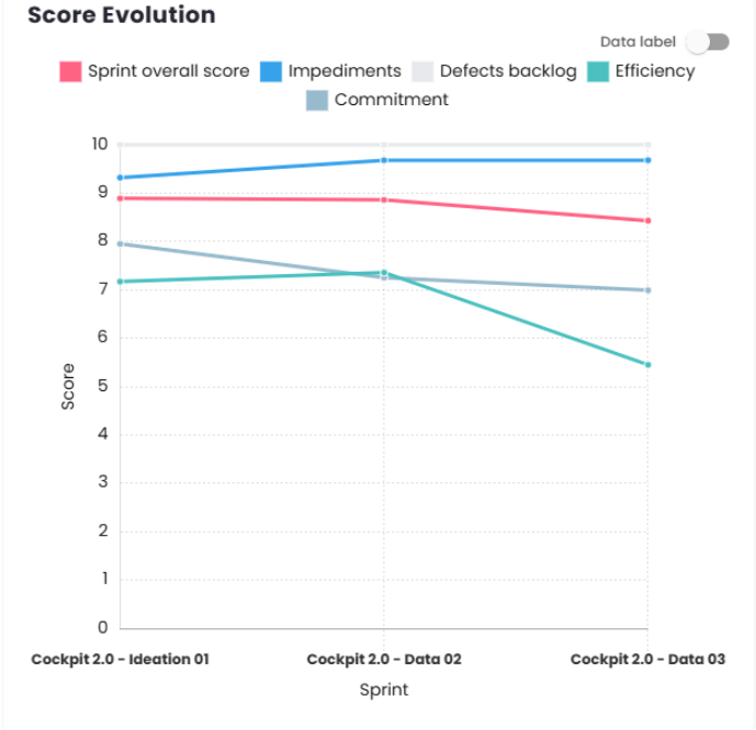
Score Evolution
This chart is designed to offer a better understanding of the evolution of the score, impediments, defect backlog, efficiency over time, and commitment.
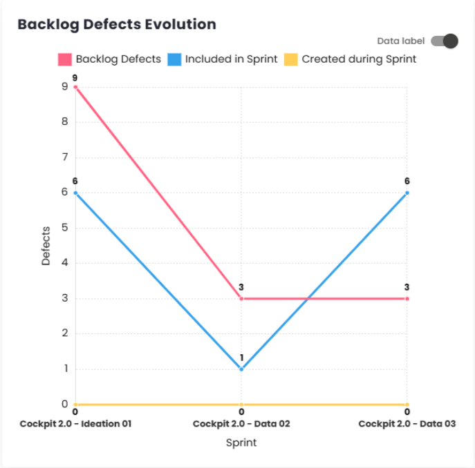
Defect Backlog Evolution
This chart, tracks the evolution of bugs. Through this indicator, it is possible to see whether the inflow and outflow of defects are occurring in the same proportion. It presents three main metrics: Defects in the Backlog, Defects Included in the Sprint, and Defects Created During the Sprint, offering a comprehensive view of defect evolution over time.
Evolution
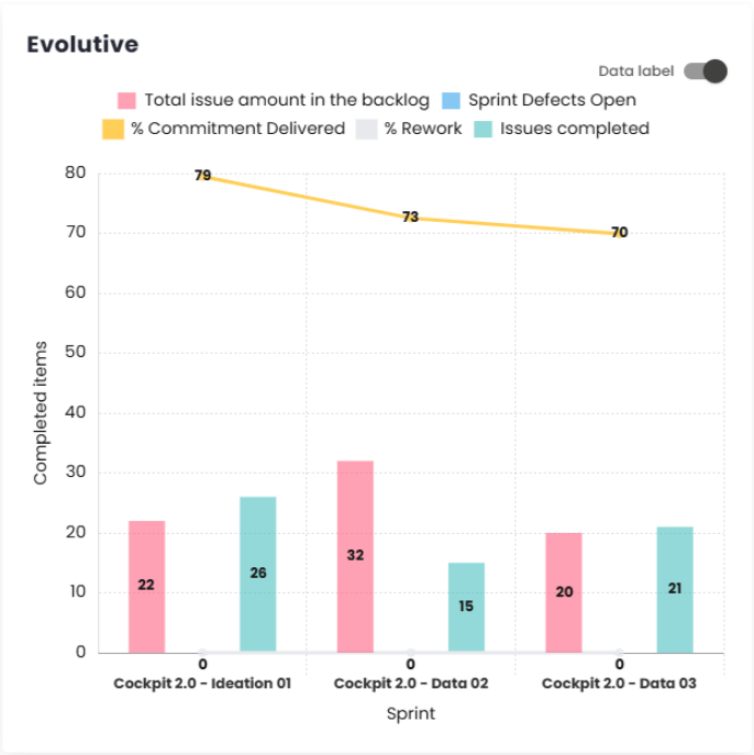
In this chart, it is possible to track several factors, such as the total number of backlog issues, open defects in the Sprint, and completed issues. Additionally, you can monitor the evolution of the percentage of delivered commitment and the percentage of rework (percentage of story bugs per user story).
Teams of Sprints/Periods and Completed Commitments
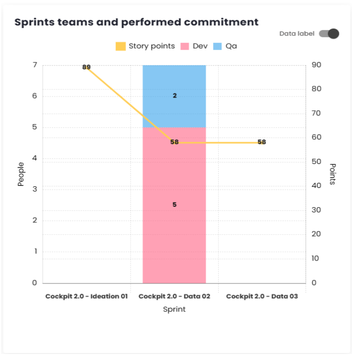
This chart allows you to see the relationship between the teams and the story points delivered within the Sprints or Periods.
Tickets distribution
This chart uses colors to illustrate the quantity and types of issues included in each Sprint or Period, allowing for a clear analysis of the work done and its volume.
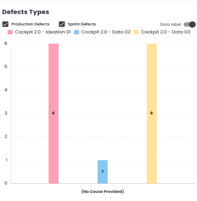
Defect type comparison
It is important to monitor bugs, and this chart provides a good overview of the bugs created during each sprint/period.
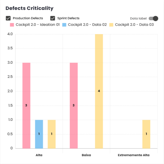
Defect Severity
This chart offers a better understanding of the severity of the bugs included in each sprint/period. It displays bars, with each sprint/period selected represented by a different color and separated by severity on the X-axis. The severity values depend on the classification used by the client in their management platform.
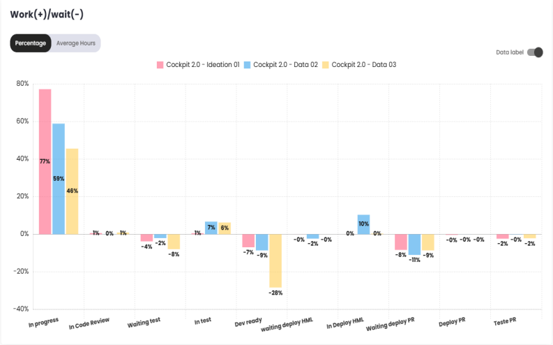
Work (+)/ Wait (-)
This chart shows a view of how much time issues spent in each status, which can be displayed in hours or as a percentage. The values for Wait status are recorded as negative and shown below the X-axis, while the Work values are positive and displayed above the X-axis.
Defect Detection Efficiency
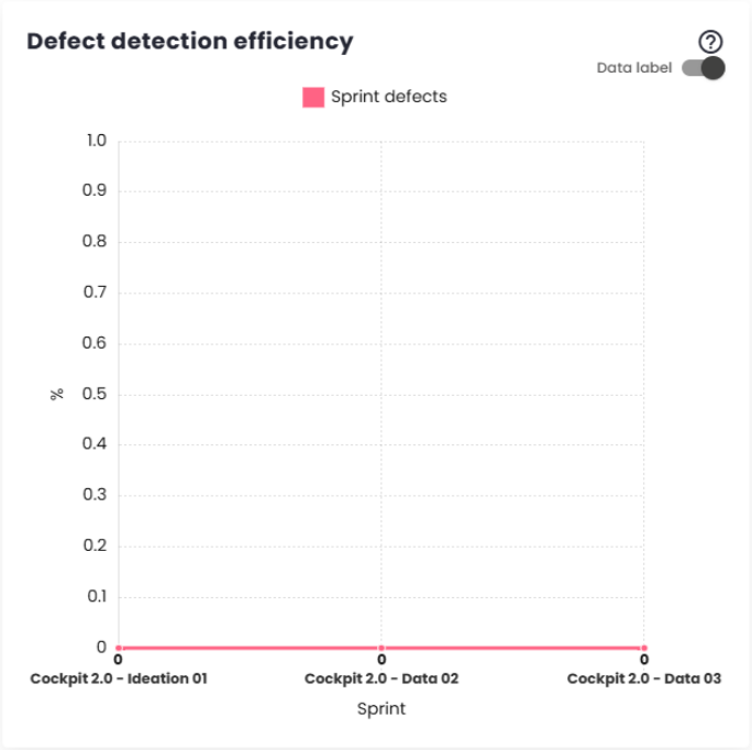
This chart shows how many defects (Story Bugs) were found in each sprint/period.
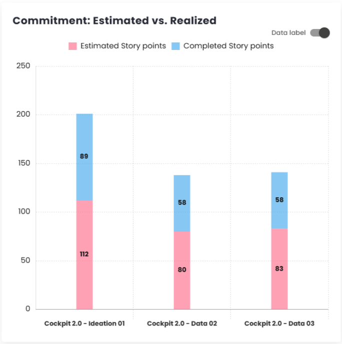
Commitment: Estimated vs Actual
This bar chart displays the number of story points estimated and completed in each sprint or period. The results are differentiated by colors, making it easier to interpret and analyze the data.
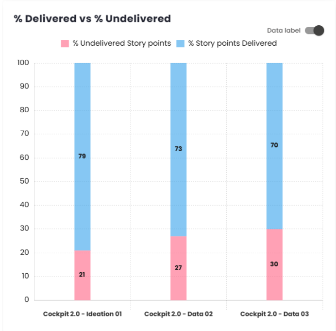
% Delivered vs % Not Delivered
Similar to the Delivered vs Completed Commitment chart, this chart shows the percentage of story points delivered versus the percentage of story points not delivered in each sprint/period. The data is presented in different colors for better visualization.
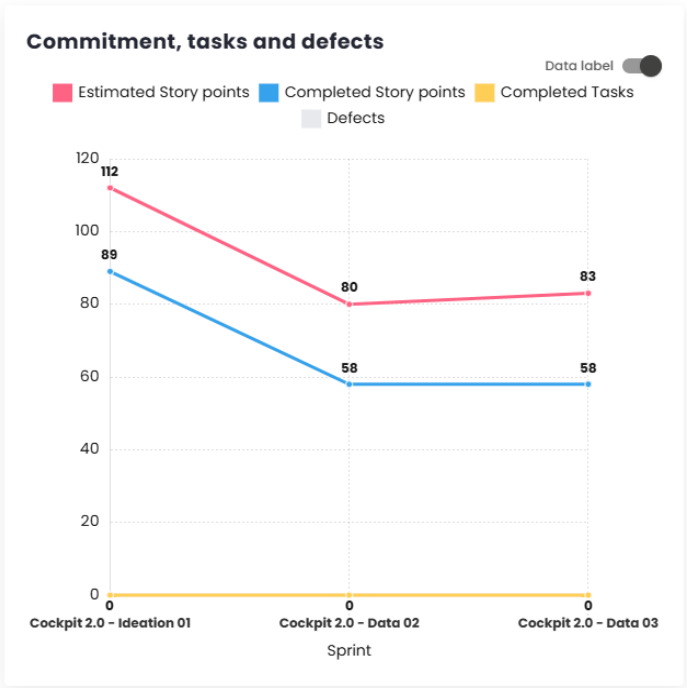
Commitment, Tasks, and Defects
This chart allows you to track the evolution and compare the selected sprints/periods, taking into account four indicators: estimated tickets, completed tickets, completed tasks, and defects.
Note: This chart will take into account the configuration set for the current estimated commitment, whether it is based on Story Points, Relative, or in the case of ticket count, it will show the items that are included in the commitment.
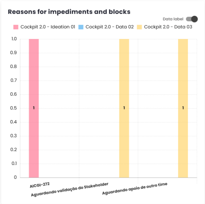
Reasons for Impediments and Blockages
This chart shows the reasons for the creation of defects (story bugs) within the sprints/-periods and how many were created for each specific reason.
Throughput
This chart, has been added so users can compare the number of tasks delivered in each time interval (Sprint or Period). The information can be viewed by class or by type, making it easier to analyze the deliveries.
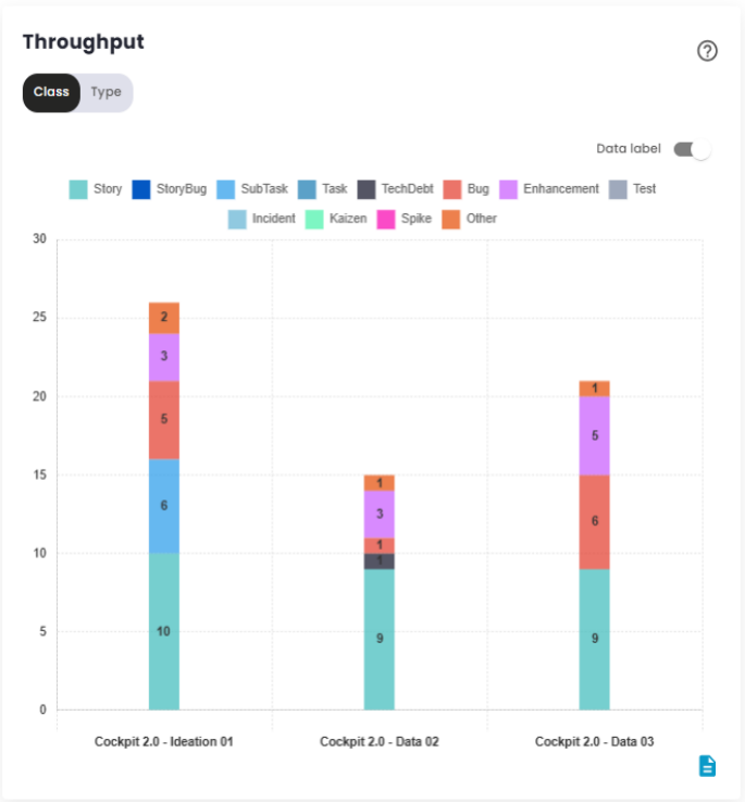
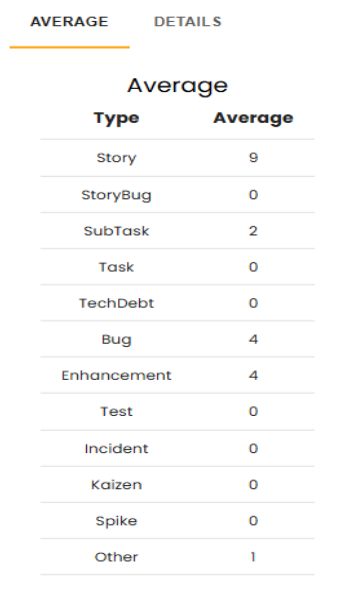
This chart provides a detailed breakdown, showing the average deliveries for each type of issue, along with an absolute summary for each compared period, grouped by the months in which there was interaction. It also calculates the average of the values represented in the image above, with the goal of clearly demonstrating which types of tasks are being addressed to improve deliveries.
Additionally, it is possible to break down the types of issues, allowing users to visualize the total number of committed items compared to the number of items delivered, all grouped by month. This analysis provides a clearer understanding of the team’s performance, helping to identify areas for improvement and efficiency in deliveries. With this information, users can adjust their strategies and focus on the issues that require special attention, thus optimizing workflow and productivity.